Hoping to expand my graphic design skills into app design, I completed the Google UX Design certificate. I thought about apps that I wished existed or could be improved, and came up with the following projects.
Case Study 1: Weather Reporting App
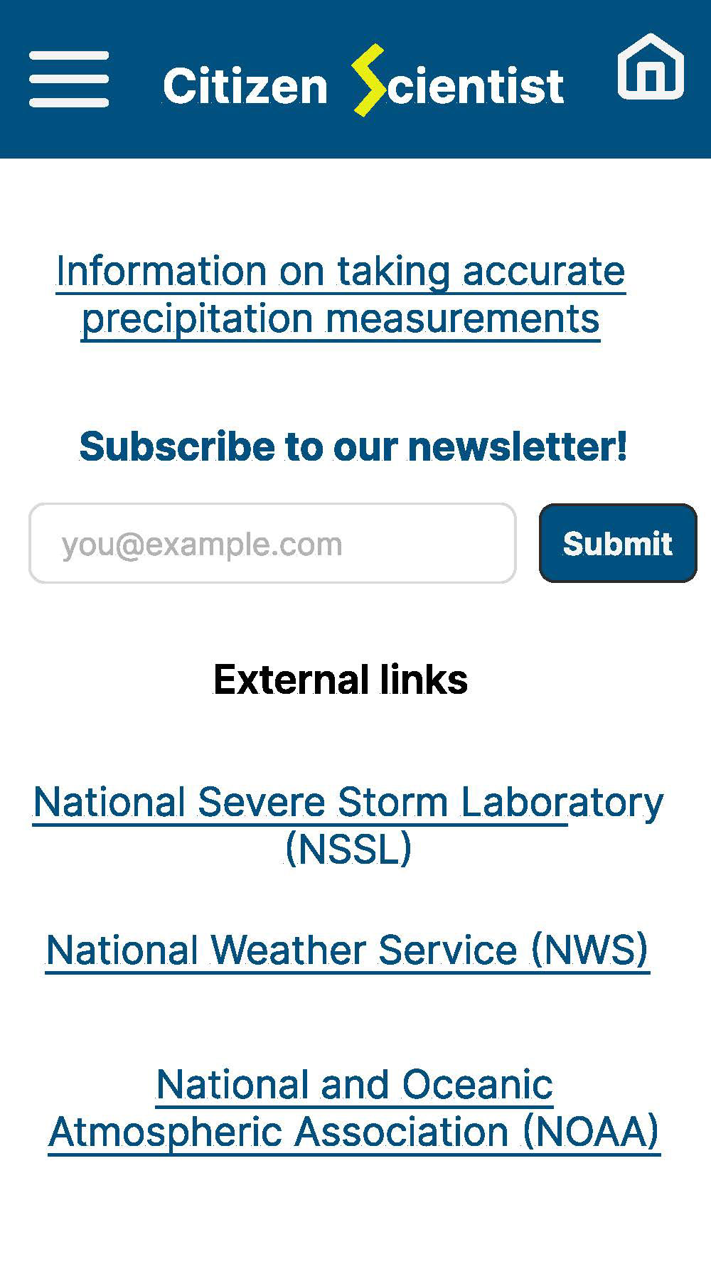
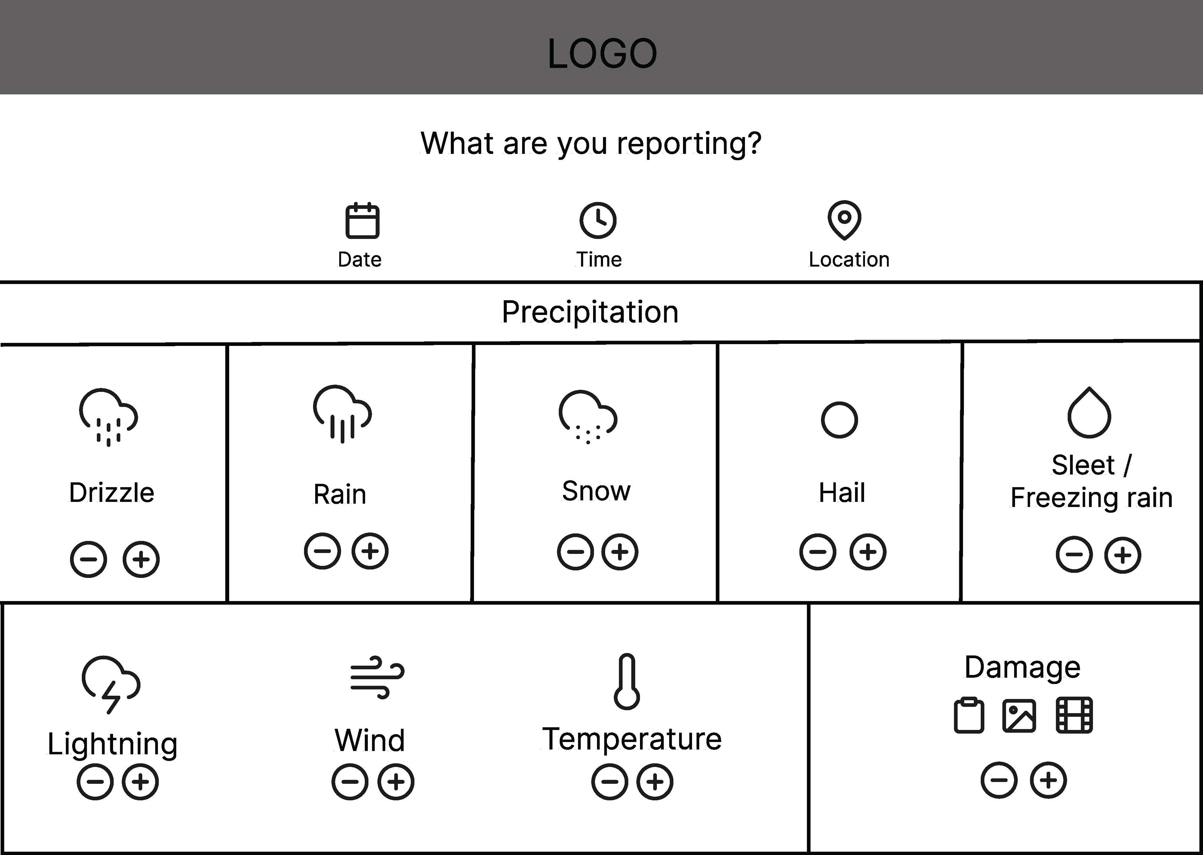
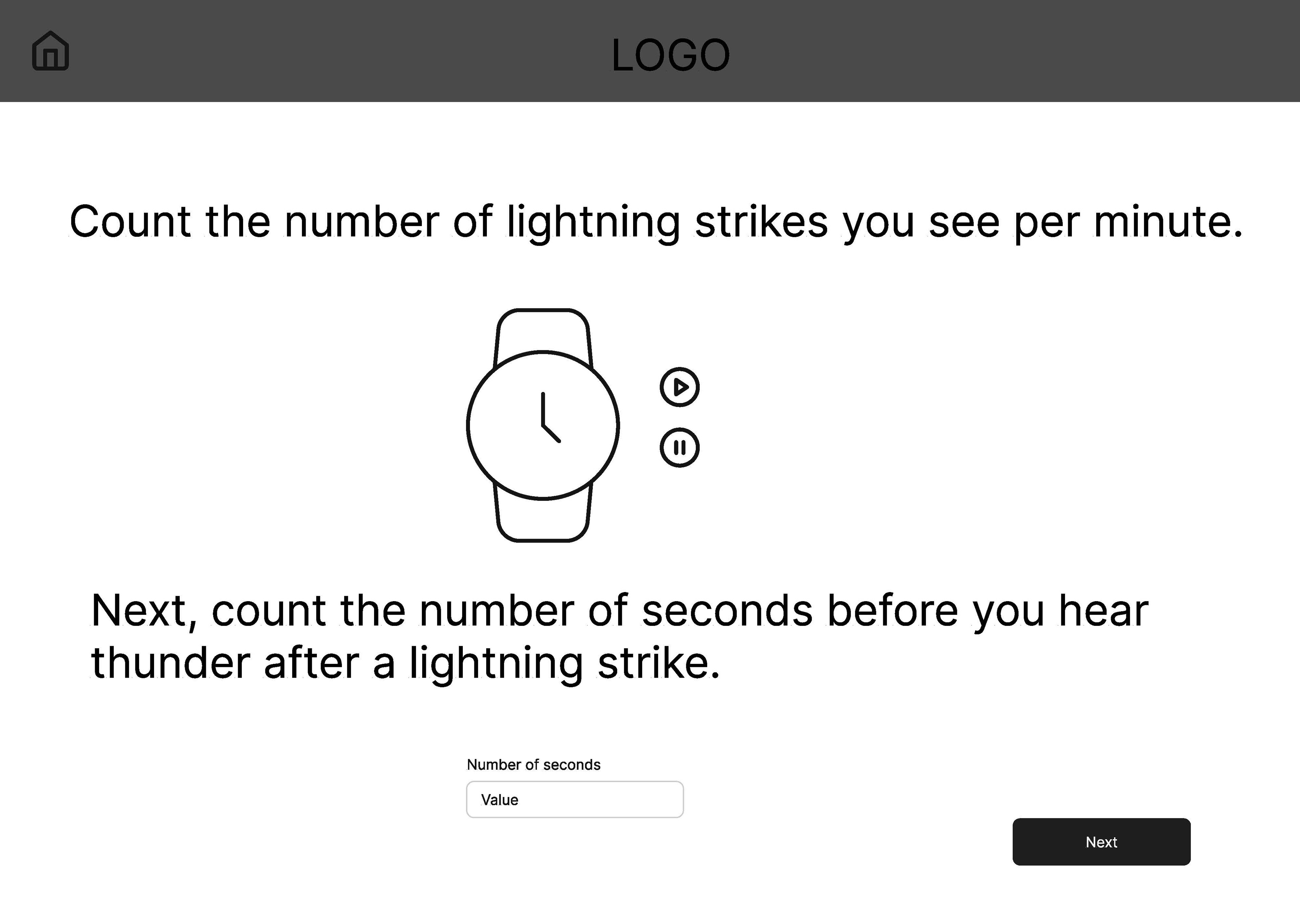
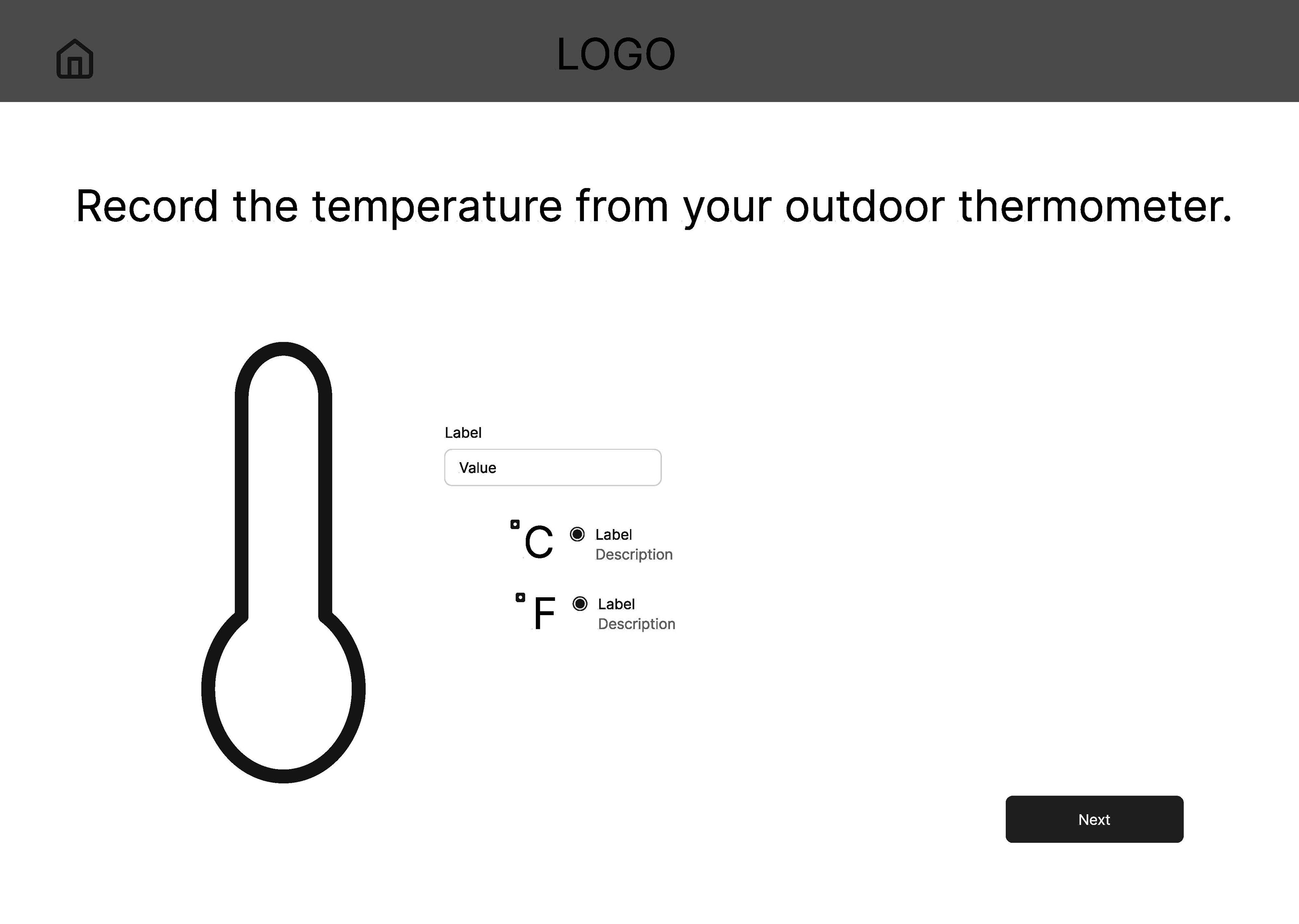
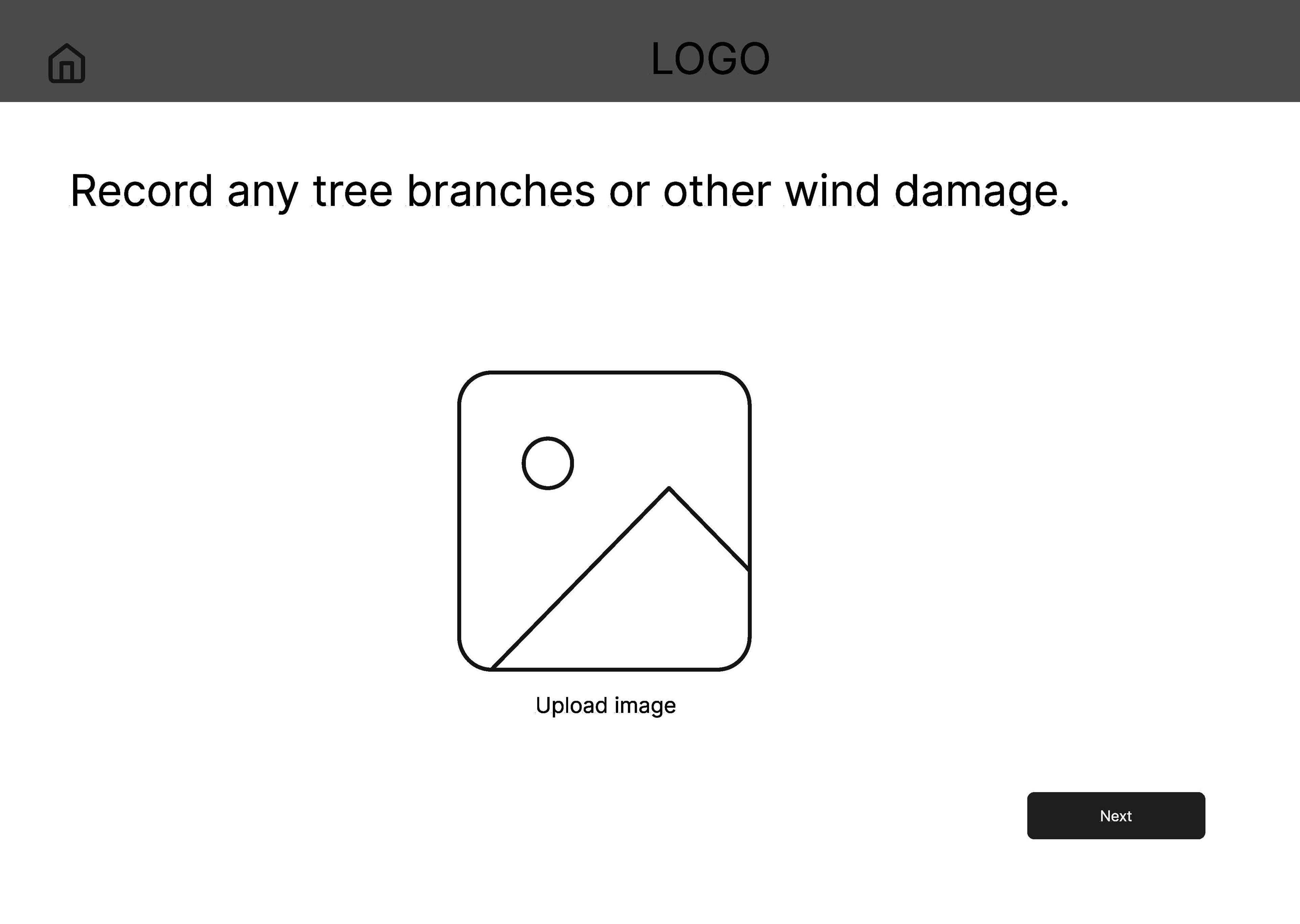
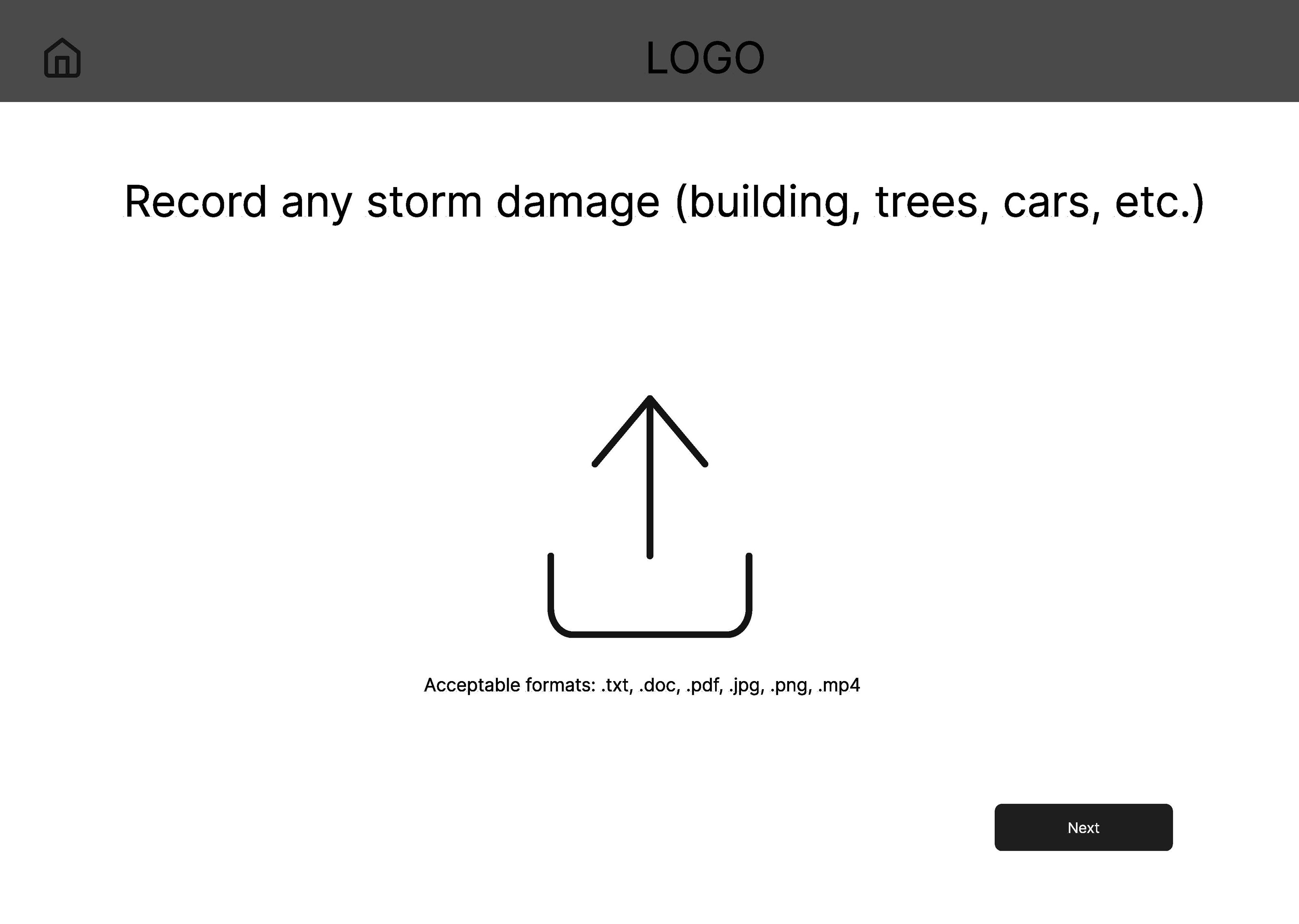
The Background: Organizations such as the National Weather Service seek data from people in locations currently experiencing weather events. The data that the general public submits helps verify their radar data, enhancing predictions.
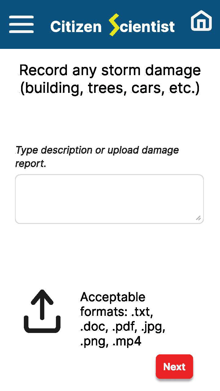
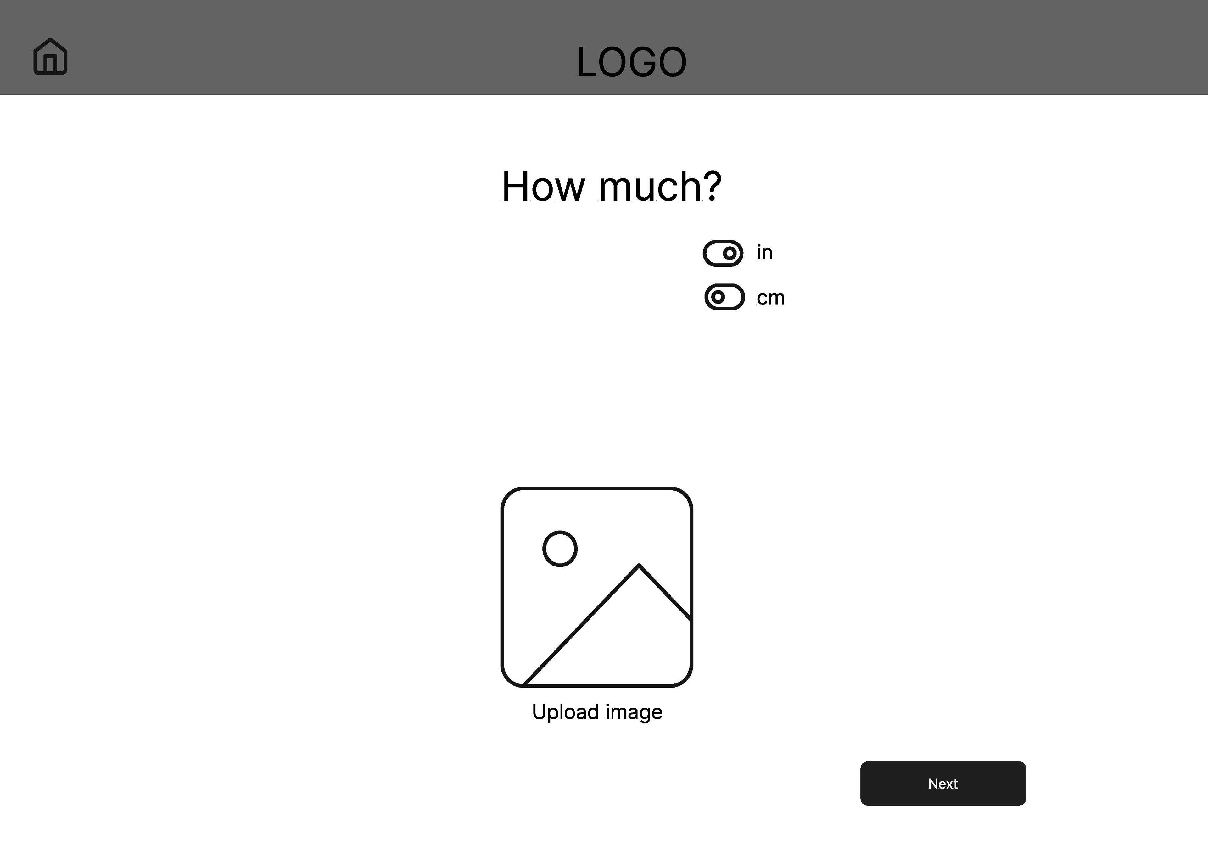
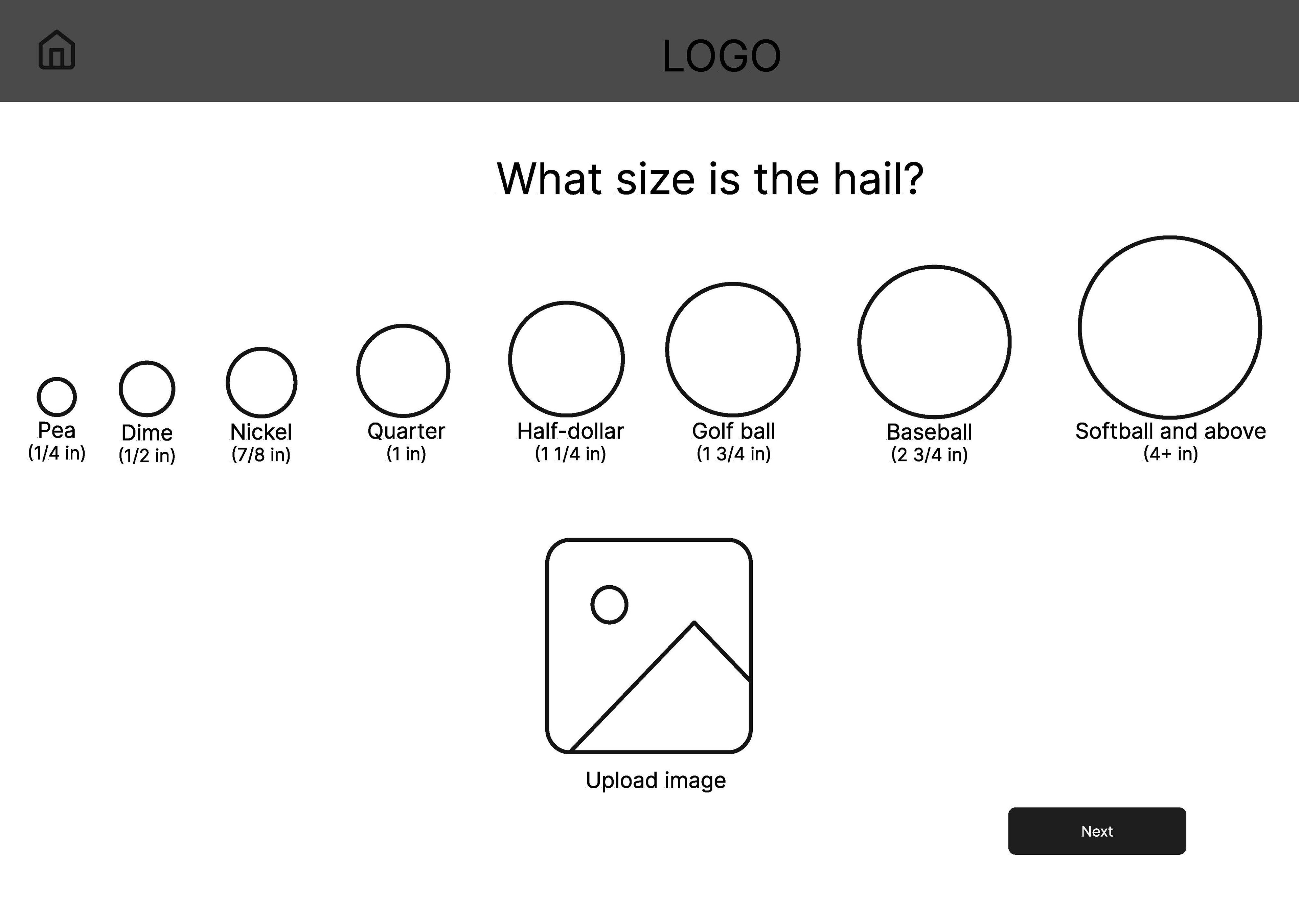
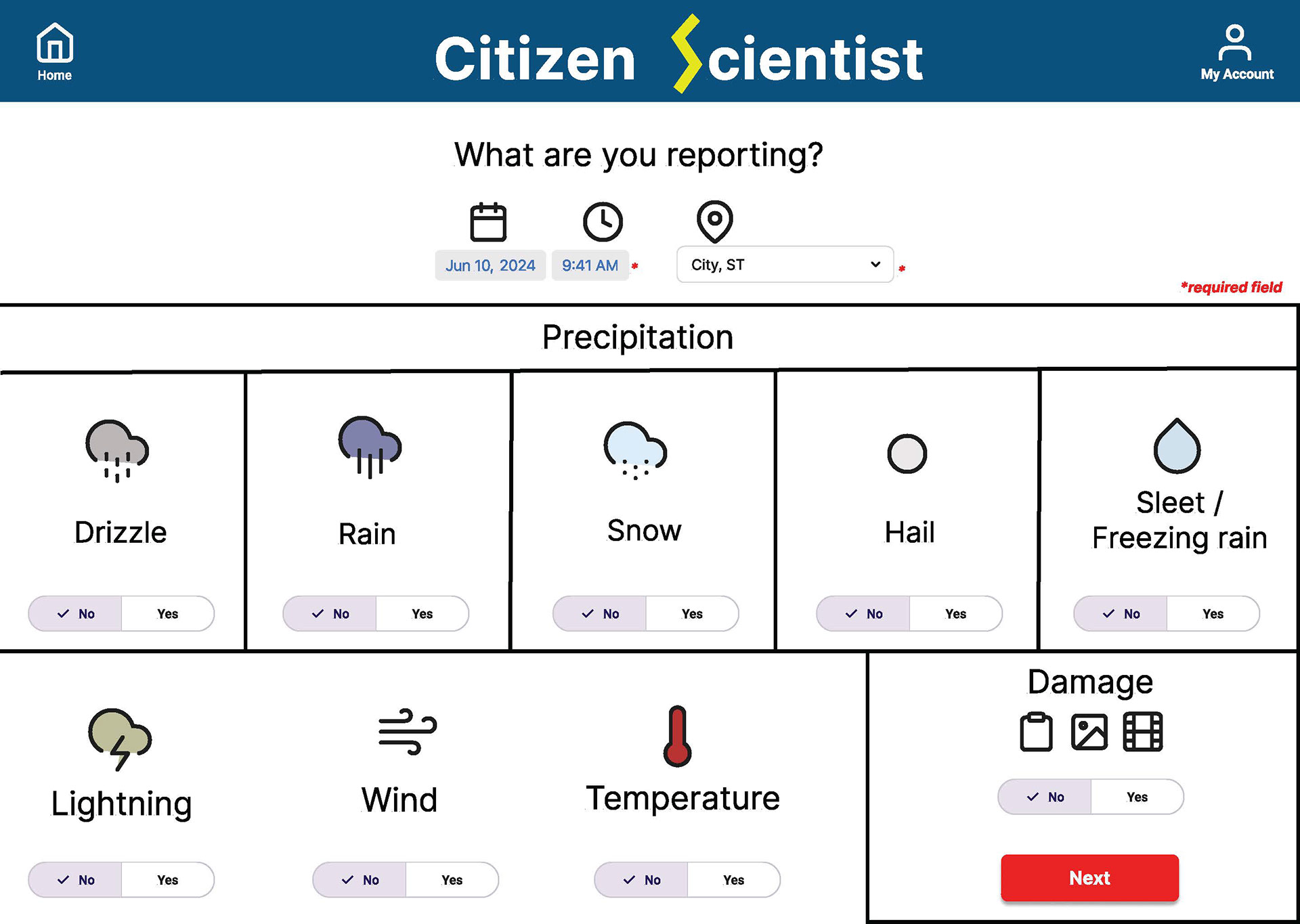
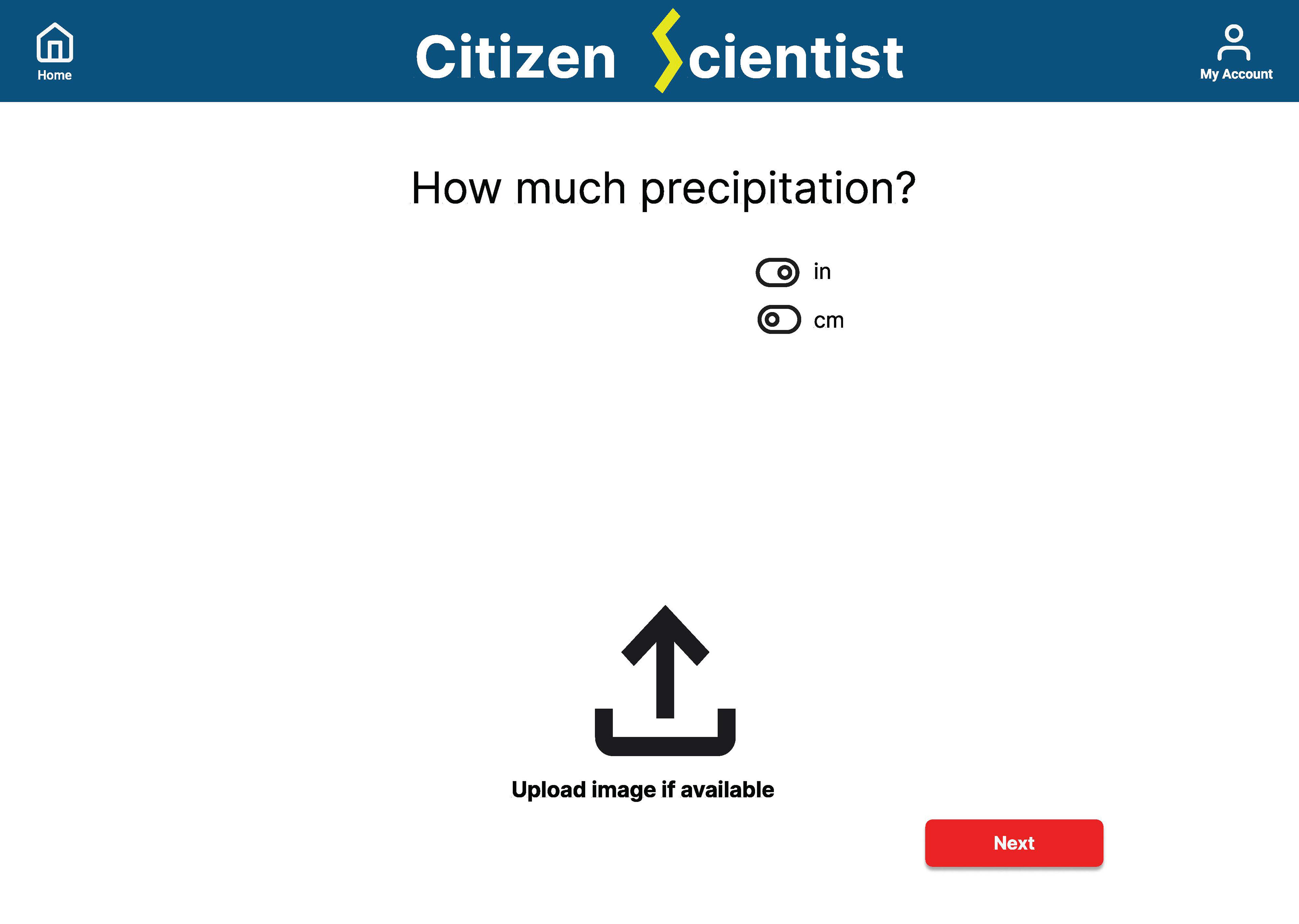
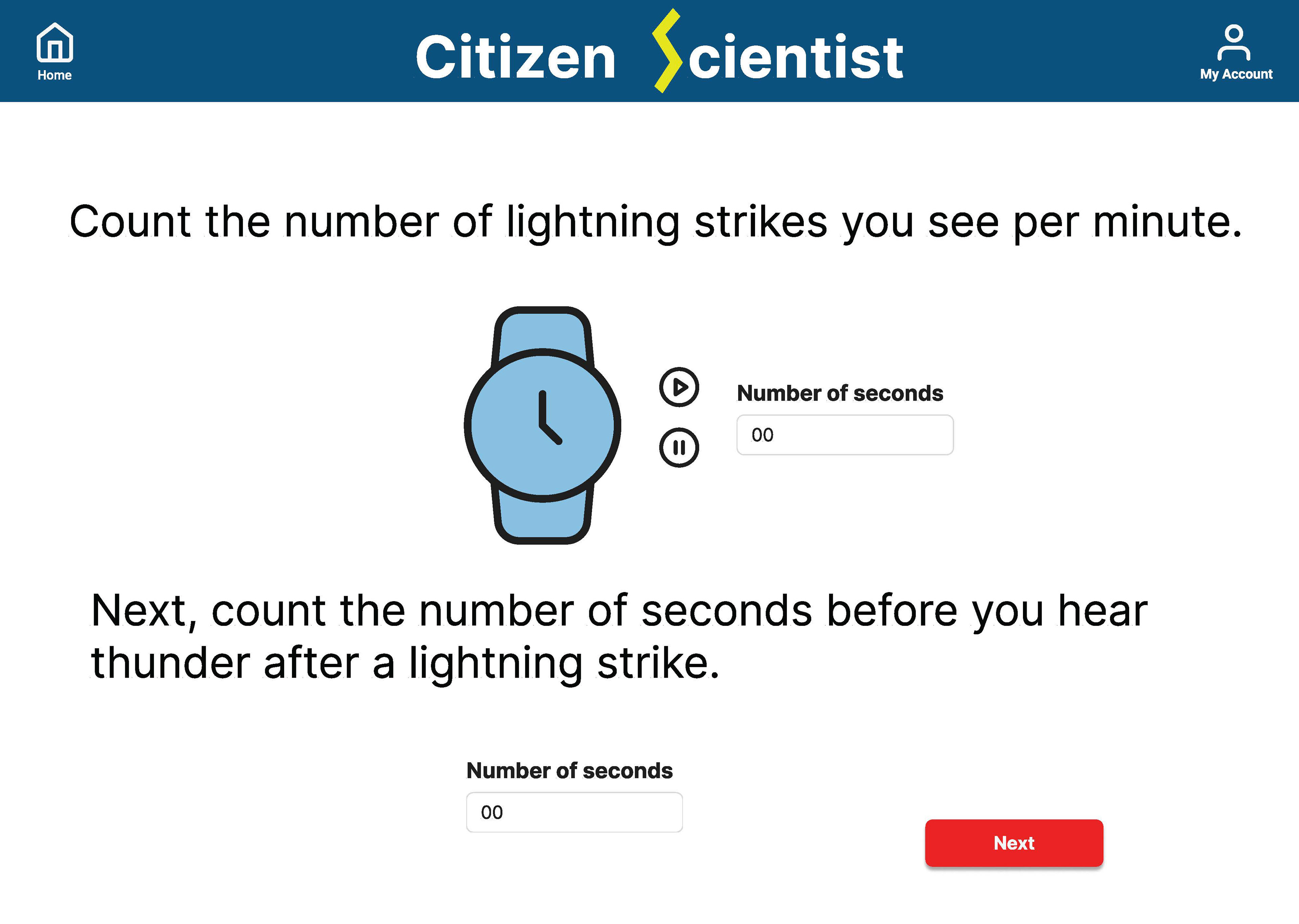
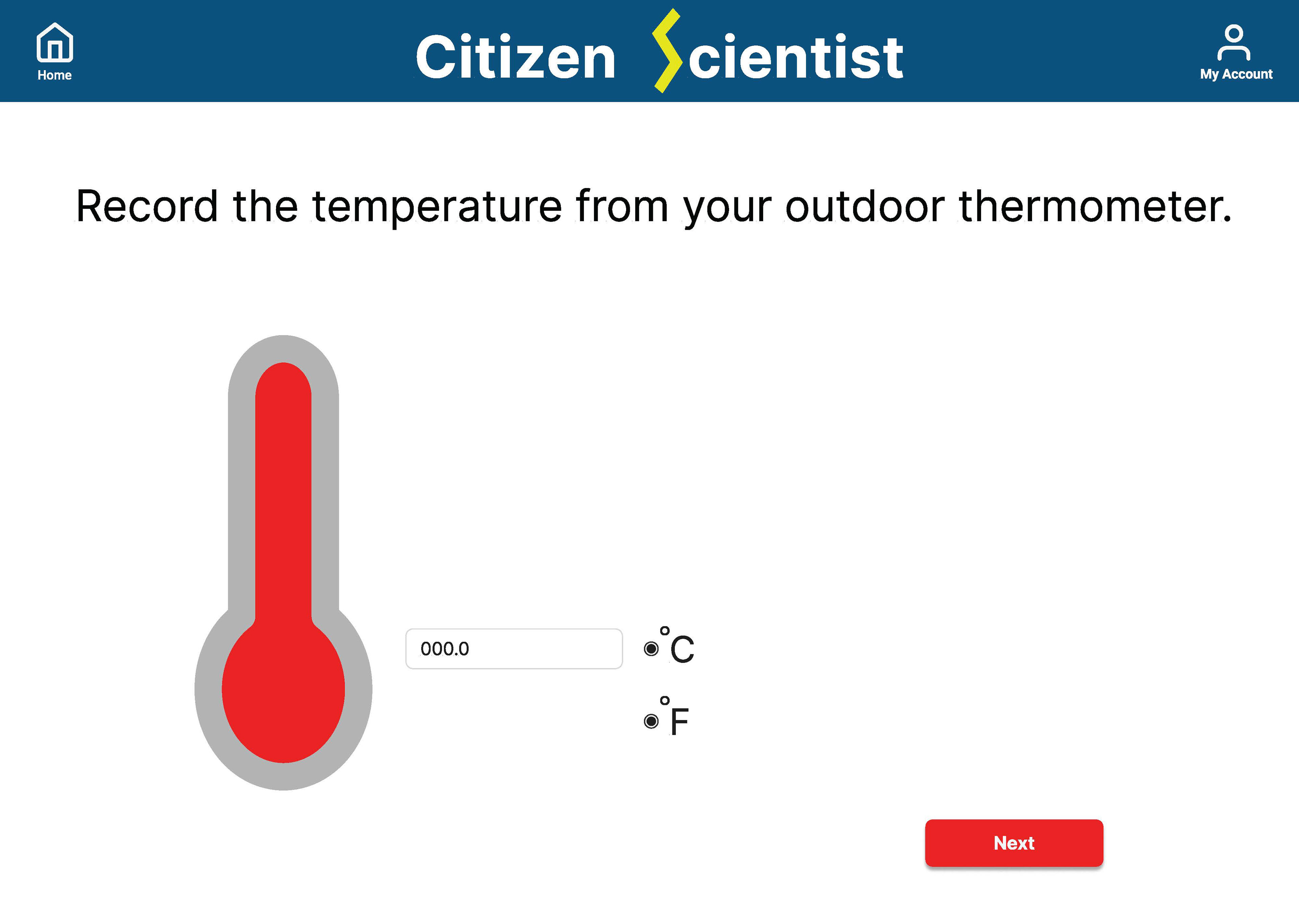
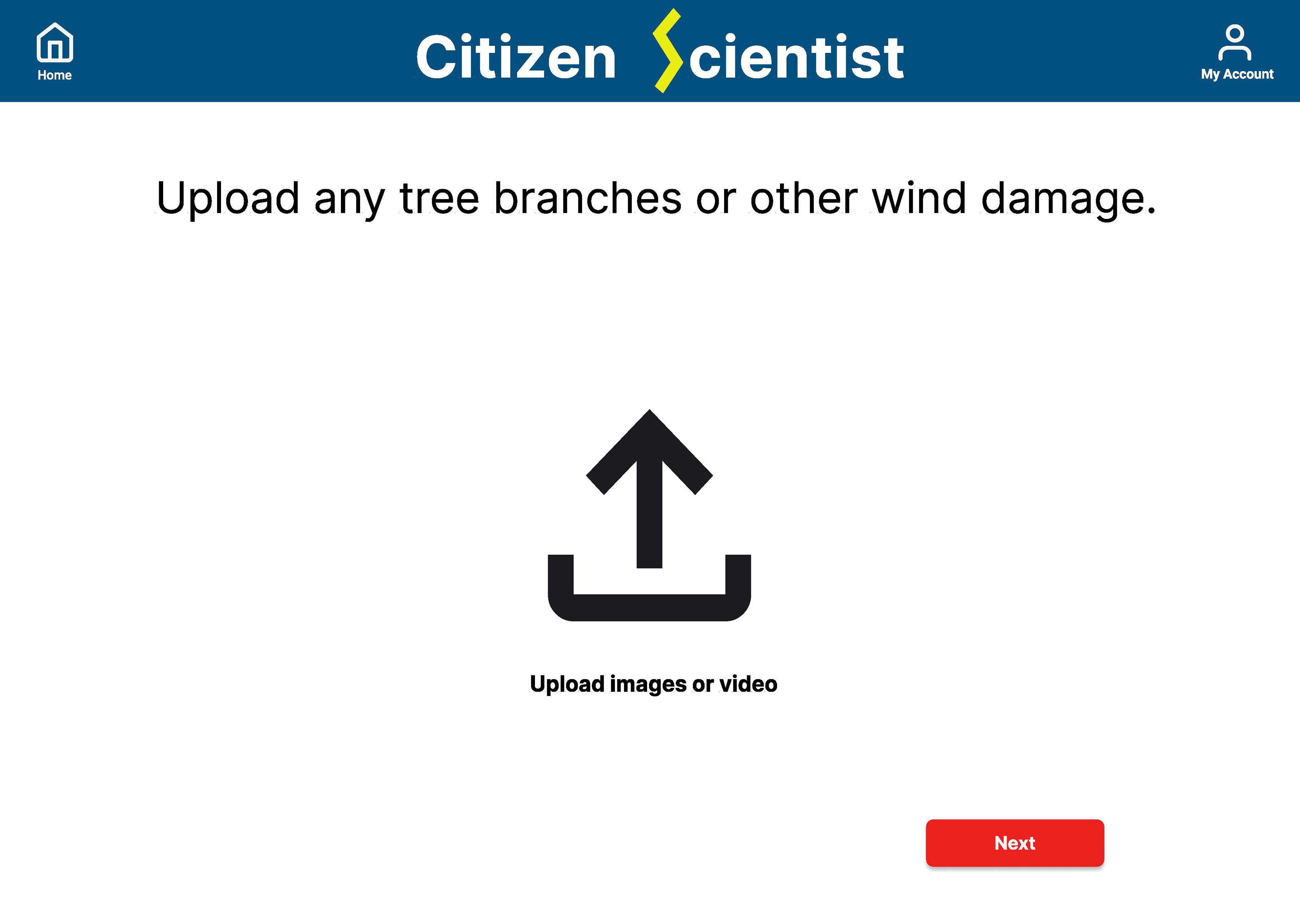
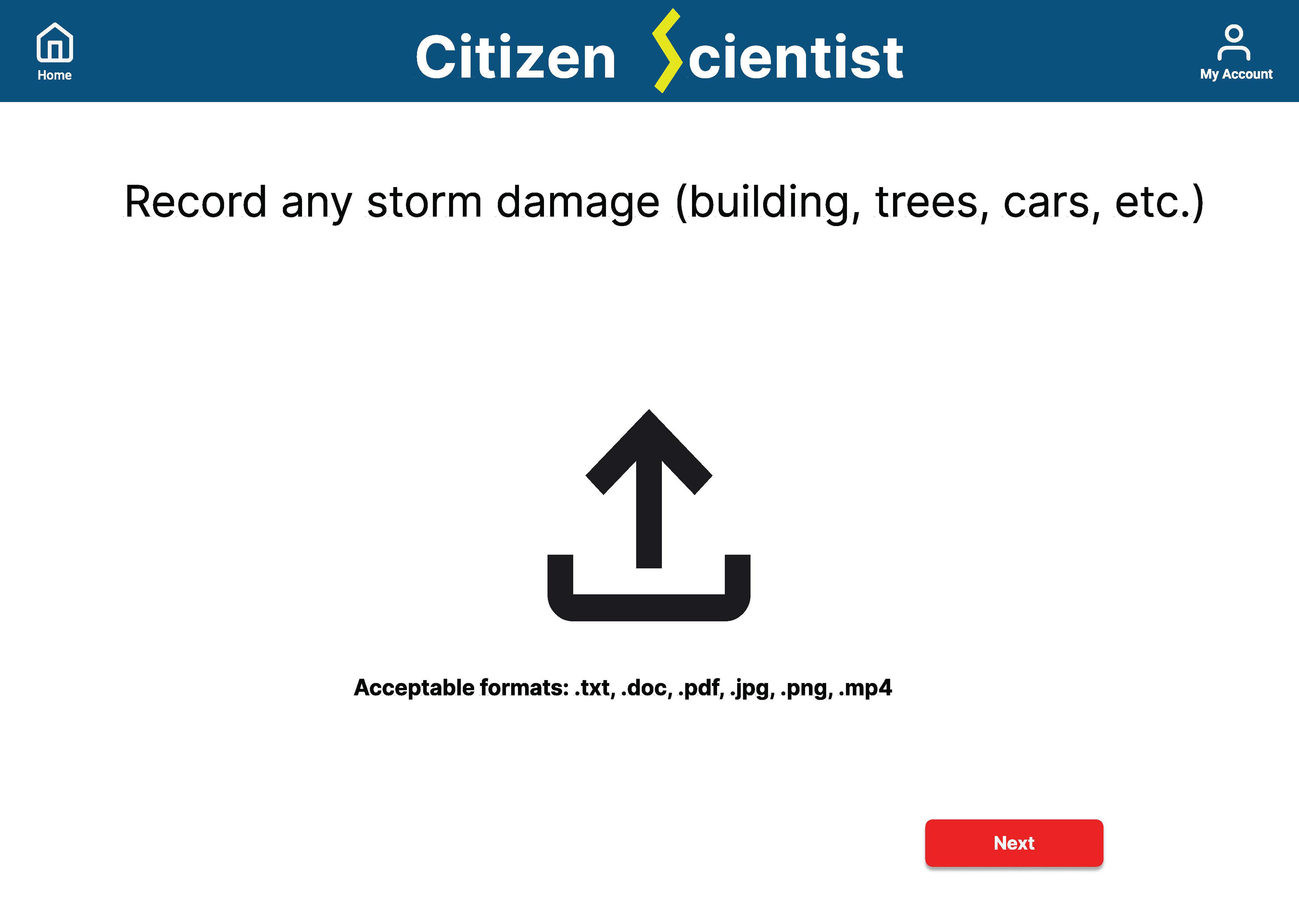
The Problem: It can be difficult to accurately collect and report this data. It's easy to overestimate amounts or sizes of precipitation. Once the data is collected, where should it go? How does it get to the meteorologists and scientists?
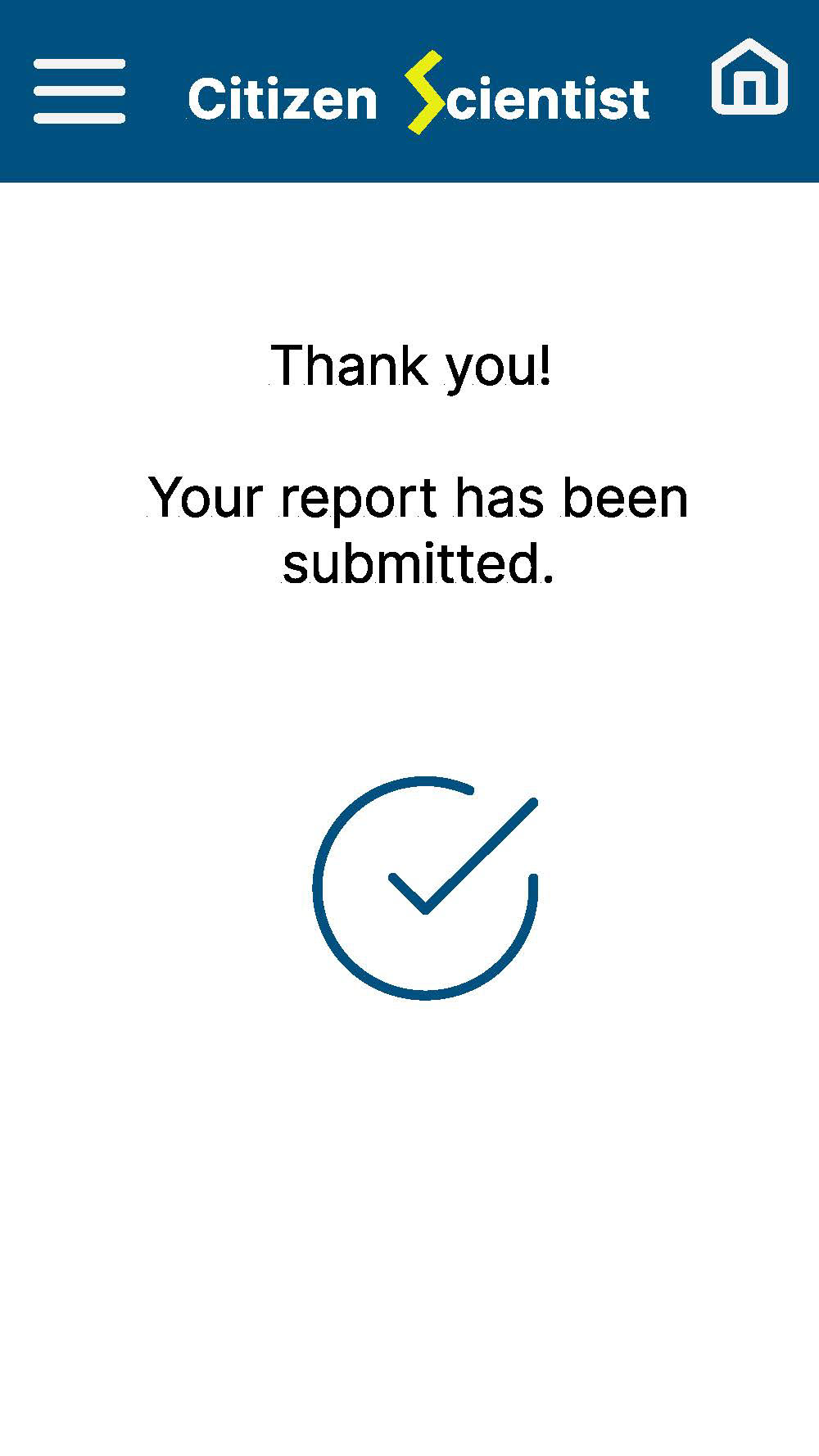
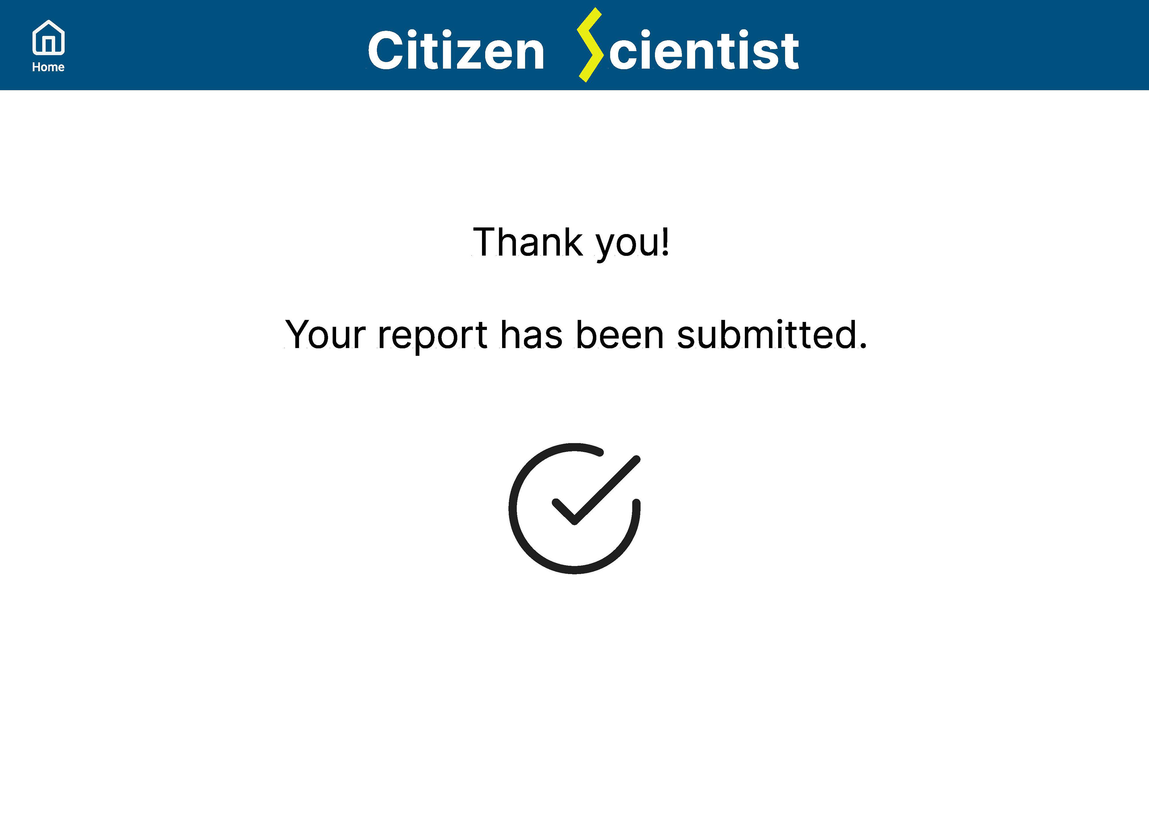
The Solution: Design an app that walks people through the process of accurately collecting and reporting meterological data. It should be fast and intuitive to use so that people aren't bored or confused by the process. If either of these things happen, people will not bother to report their data.
User Experience Research: I began by researching what was already in existence for this type of data reporting. There are indeed already some apps currently in use. One, called mPING, is particularly easy to navigate. It works mostly by use of layered menus, and contains mostly text. I could see a use for an app that was more illustrative in nature, in case users had issues with reading text.
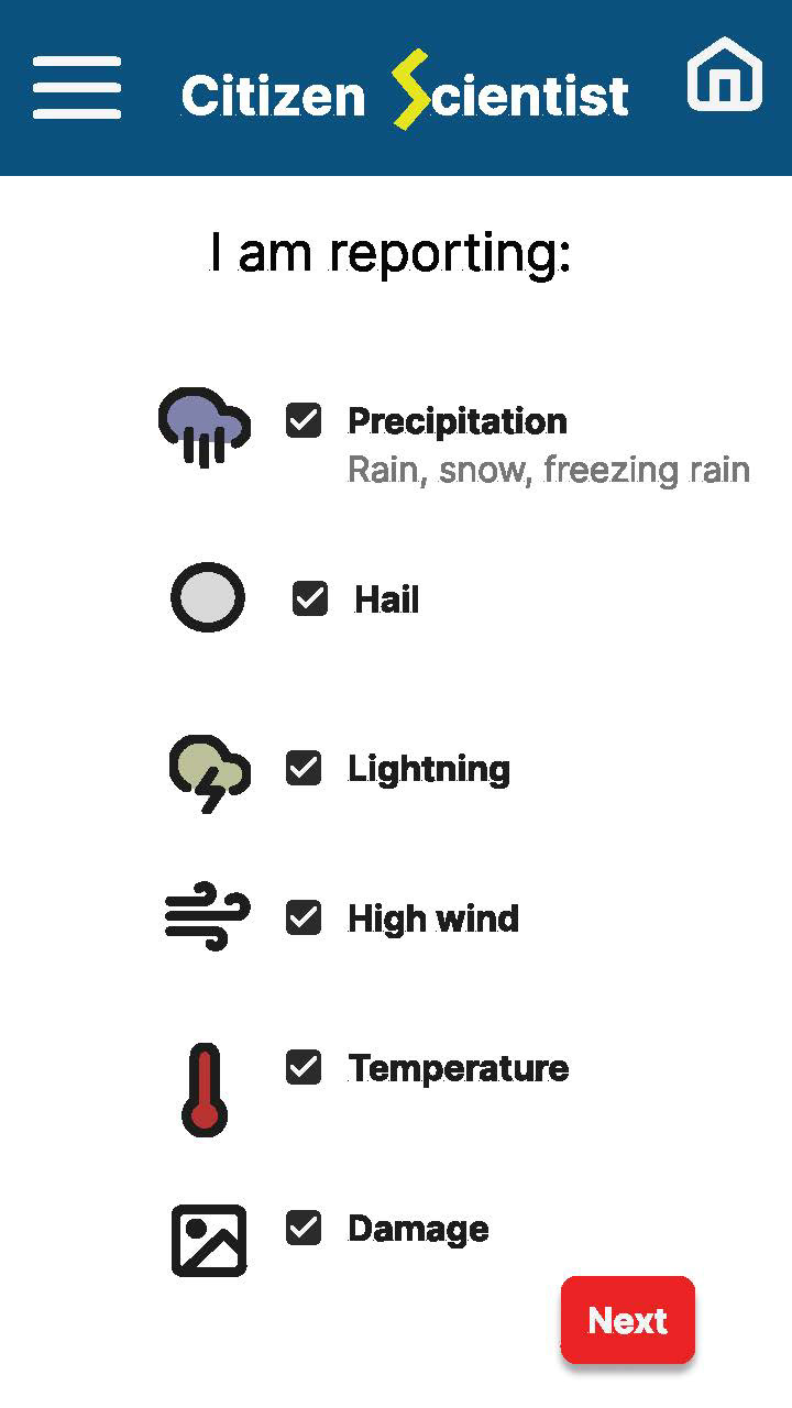
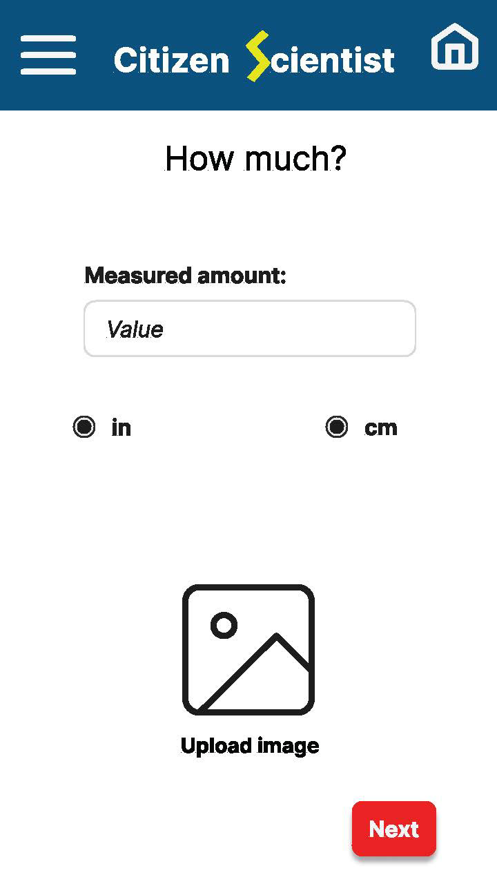
After speaking with a few local meteorologists and non-meteorologists, I determined what types of data would be helpful for the public to submit, as well as preferred ways to submit that data (clicking and selecting, rather than strictly typing in information).
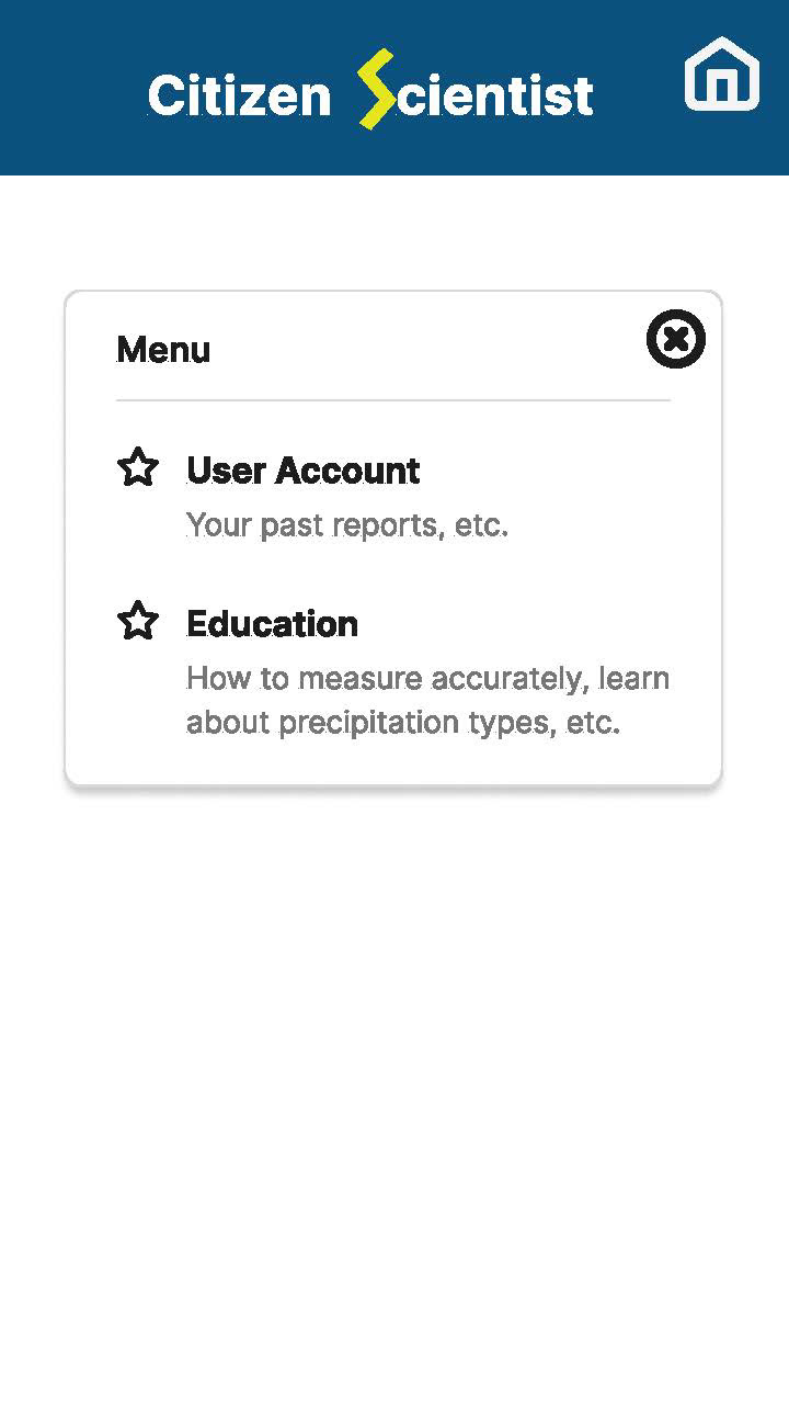
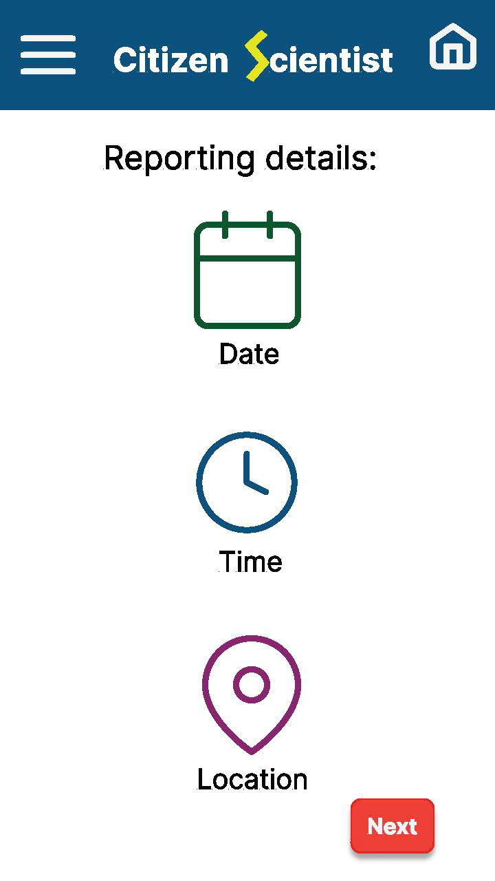
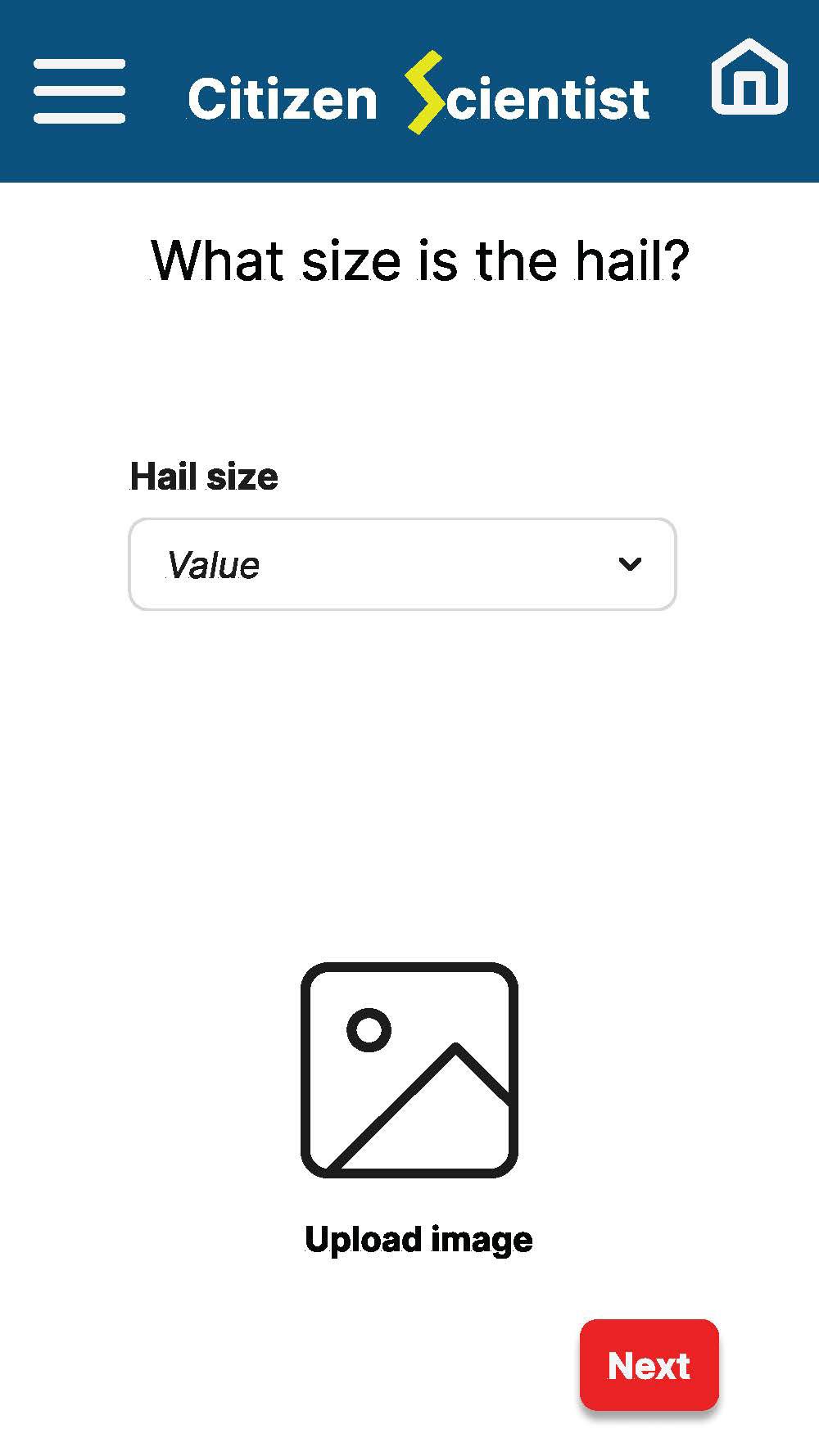
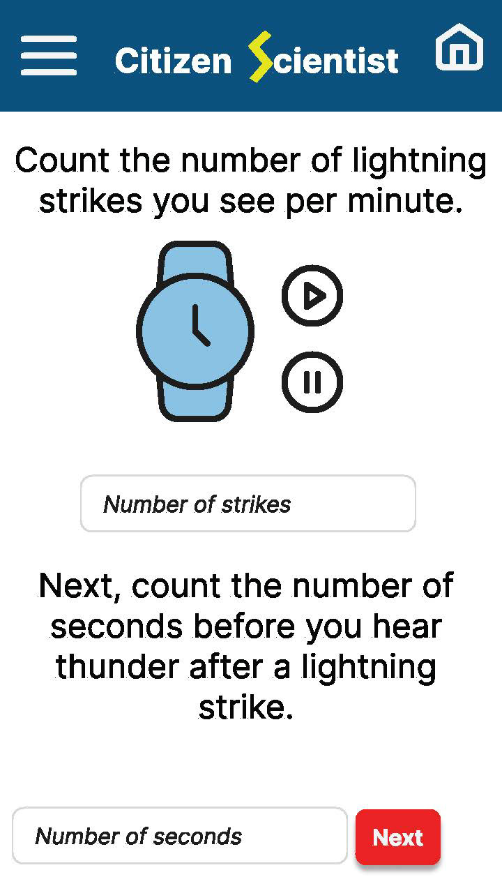
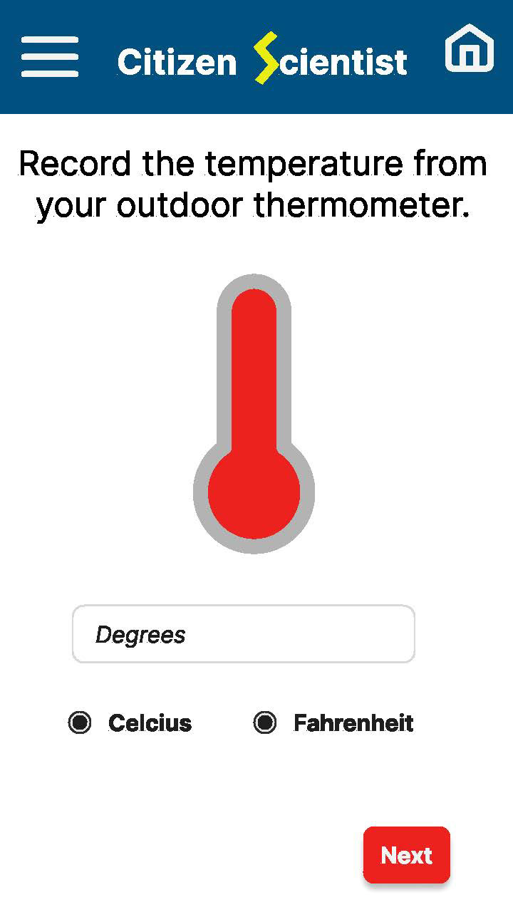
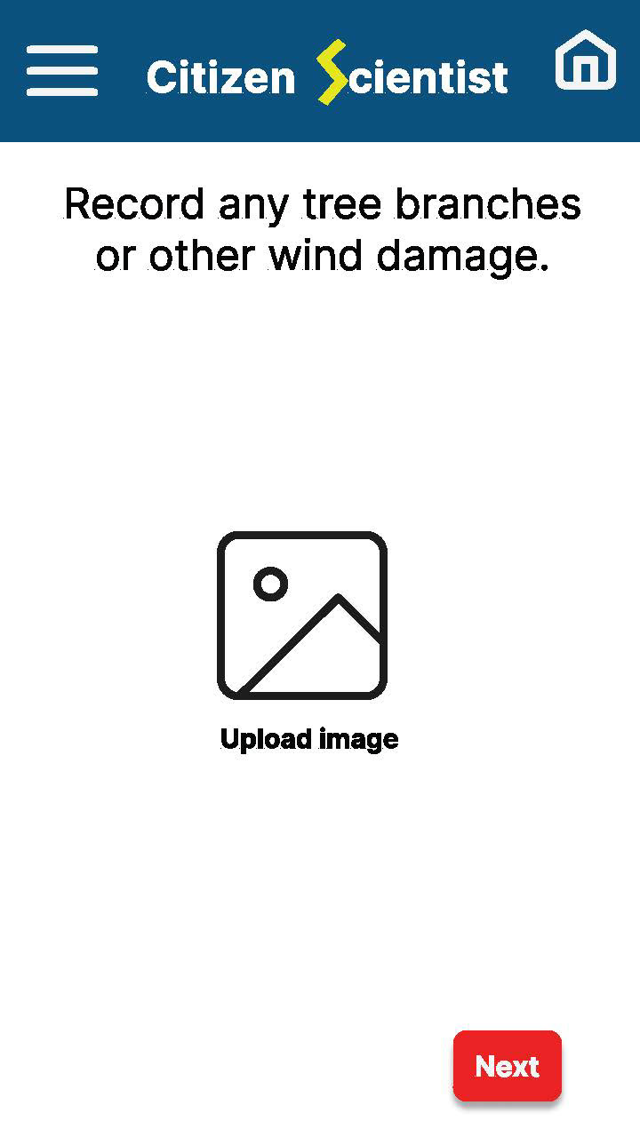
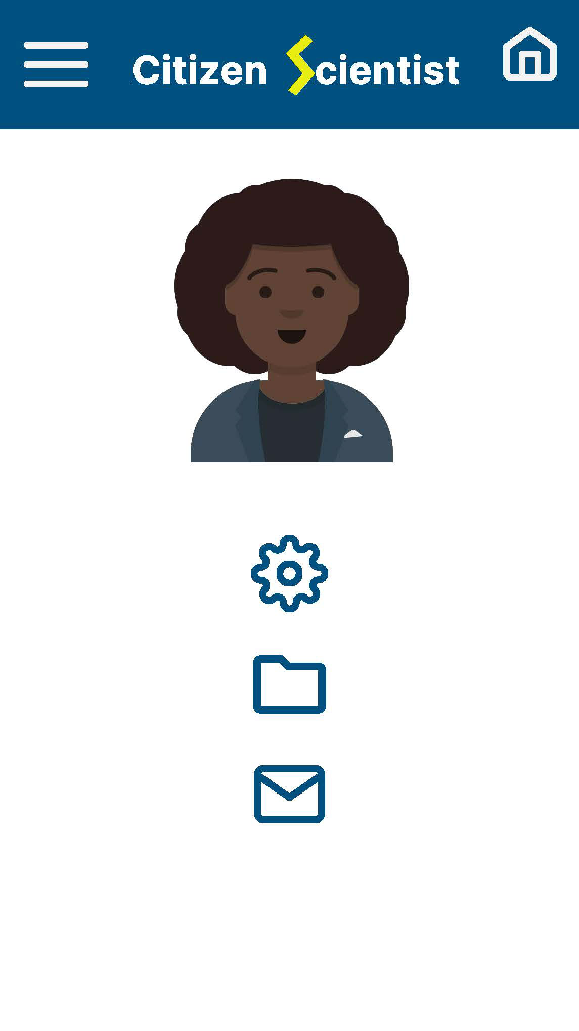
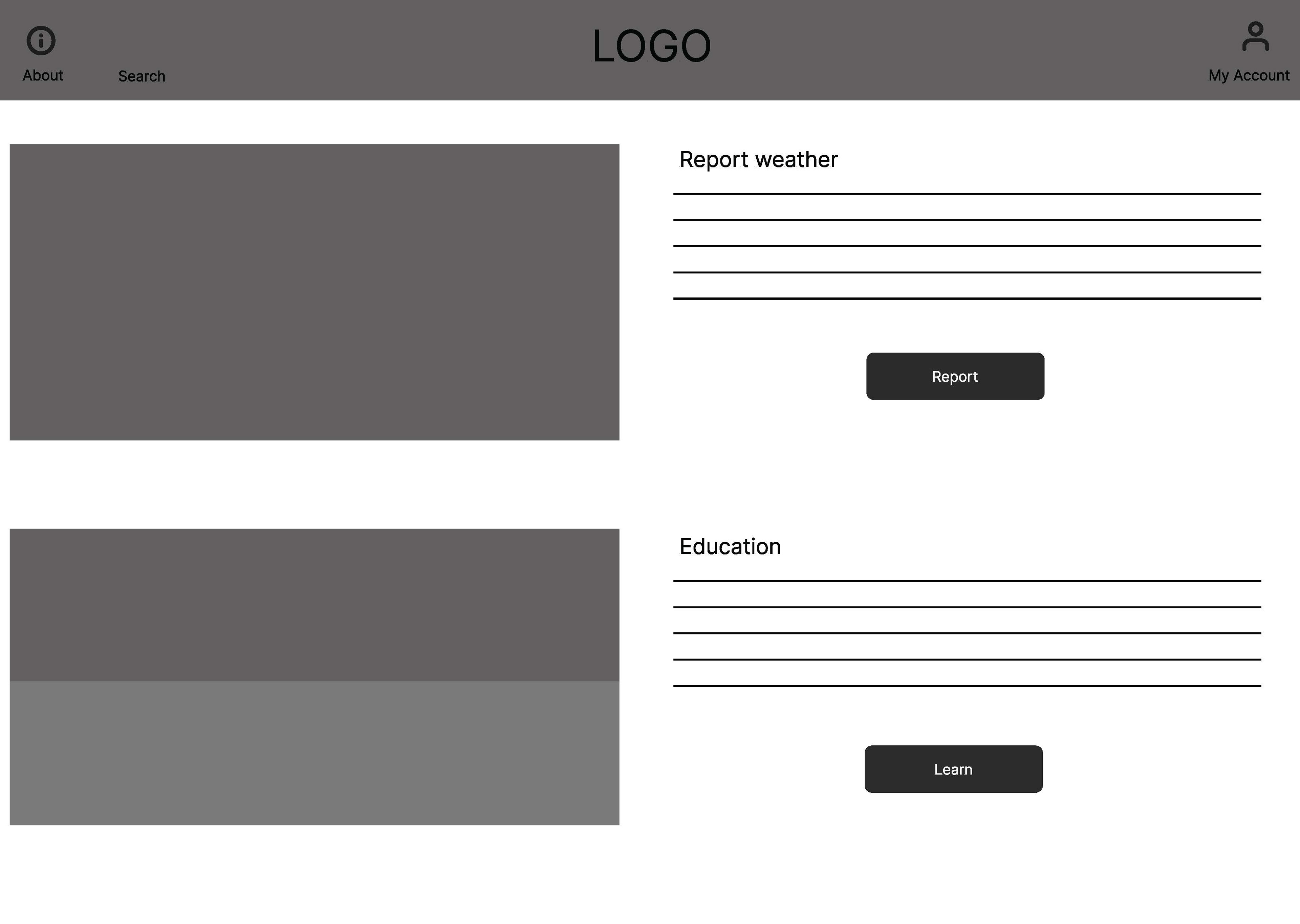
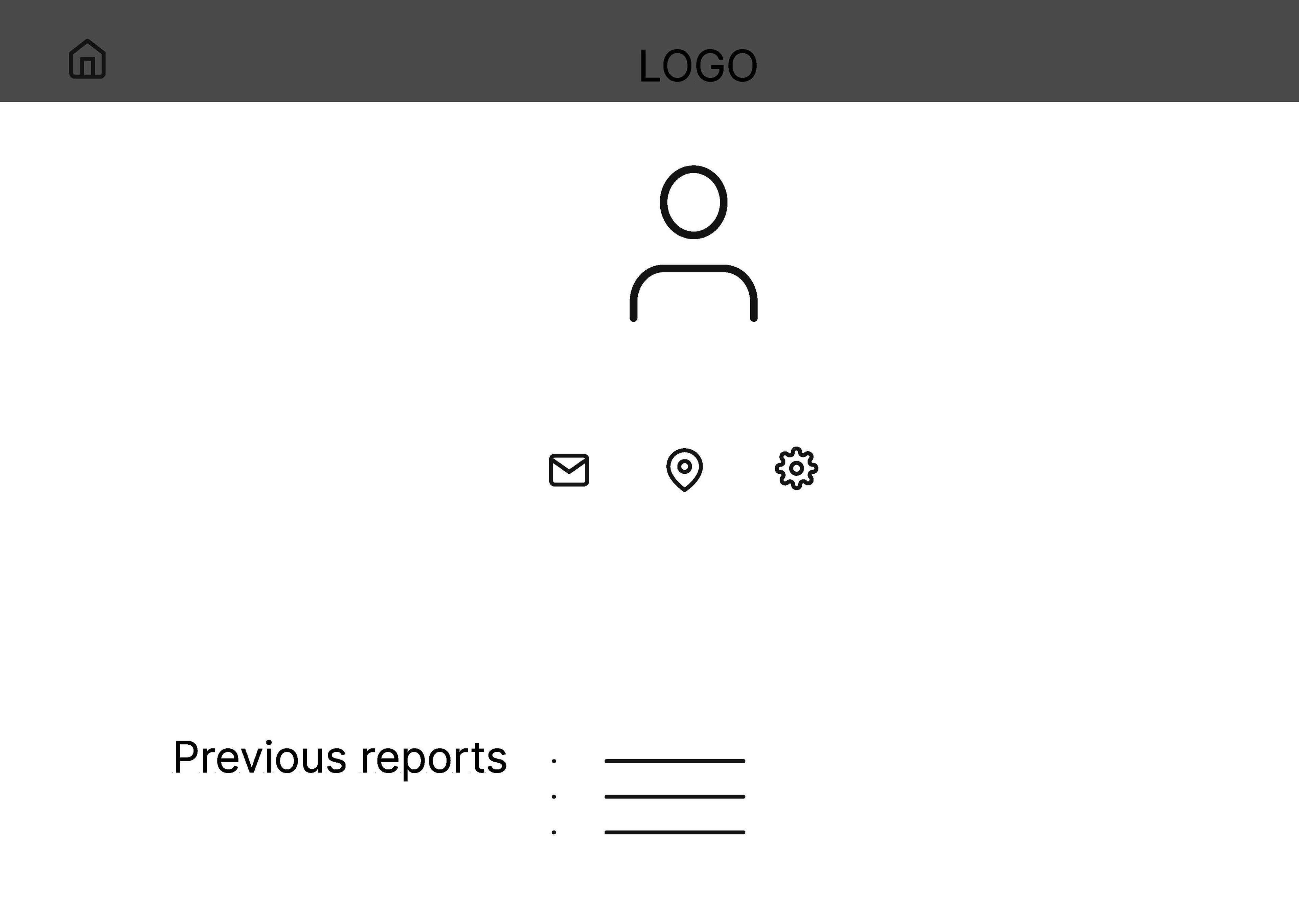
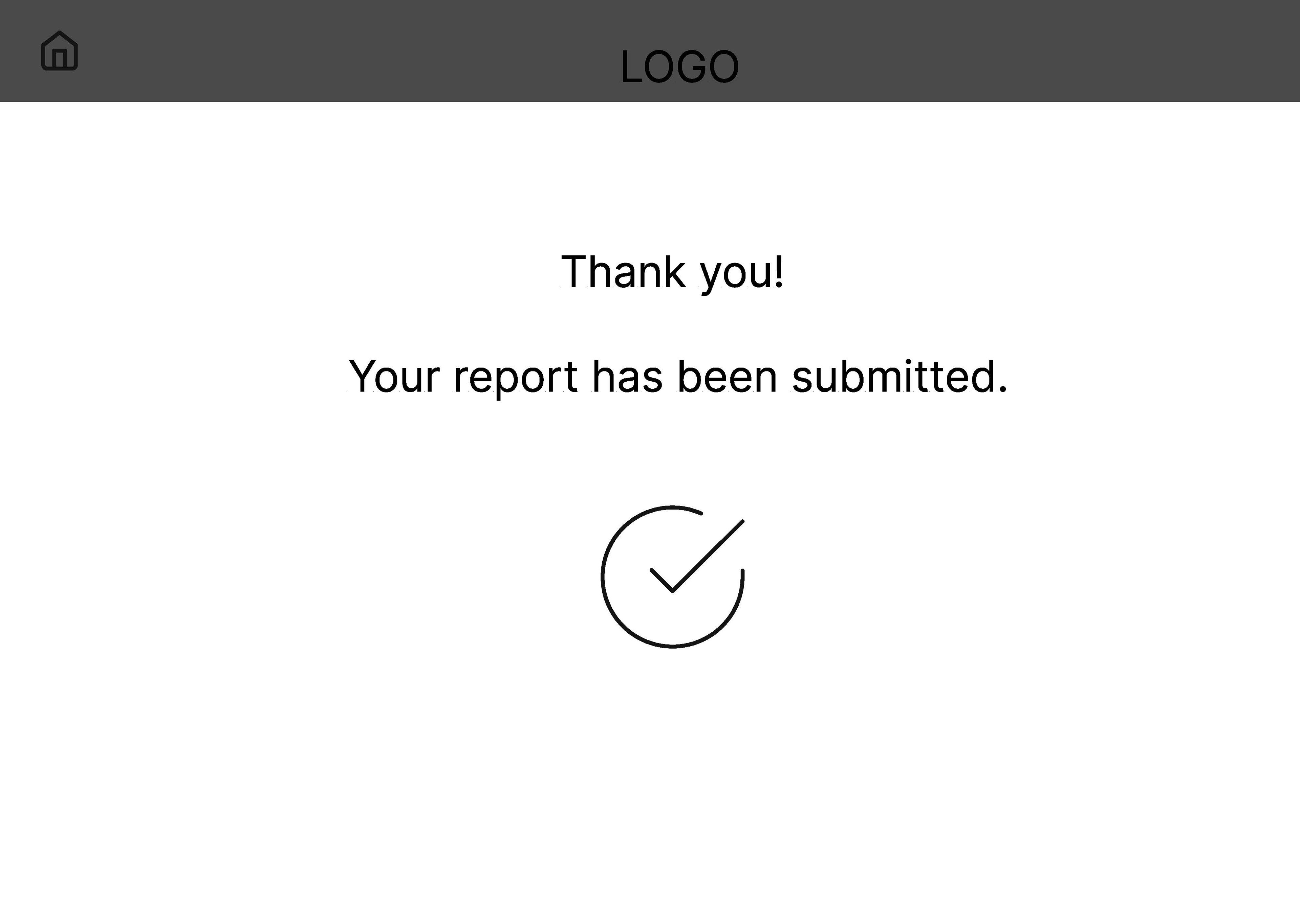
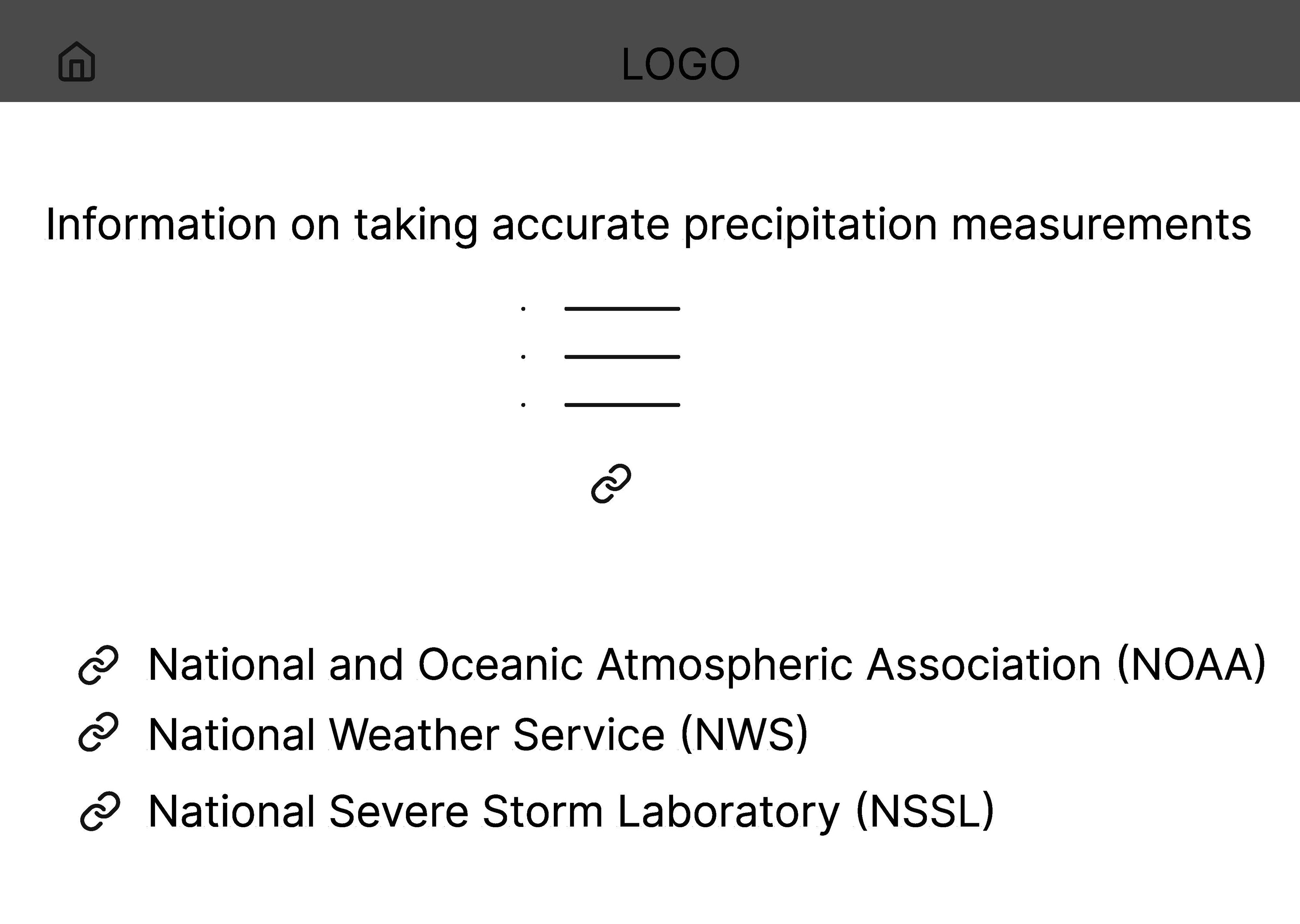
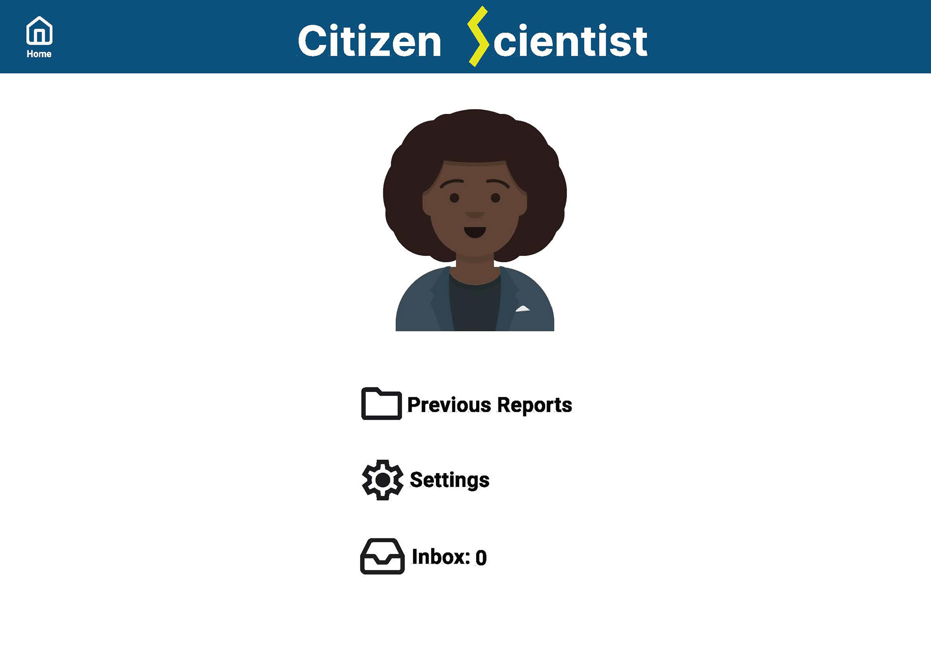
Wireframing and Design: I began with an outline of how I wanted the app to look, and then did some basic wireframing on paper. Once I was satisfied with the layout and the order of the screens, I made high and low fidelity wireframes in Figma.
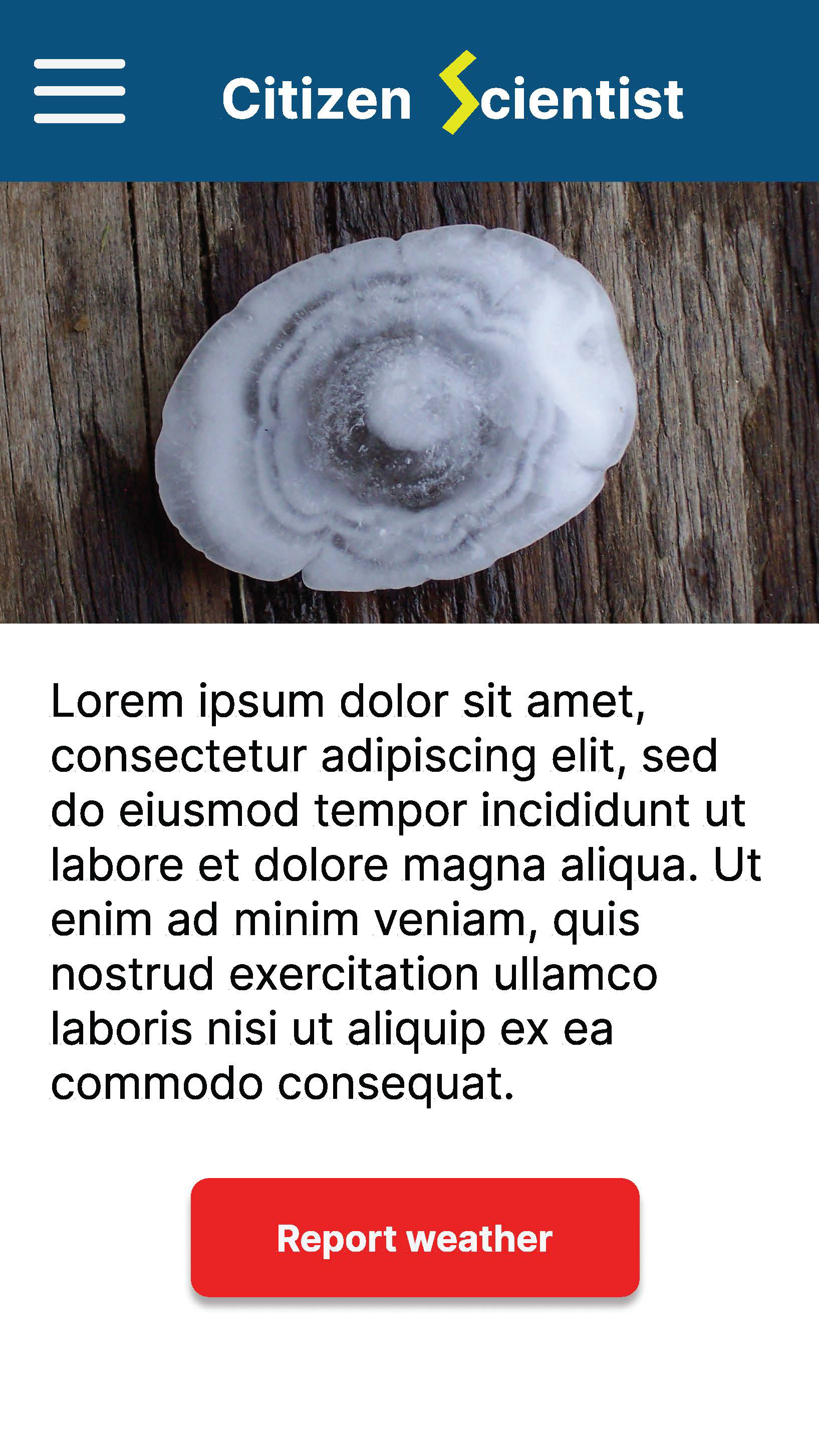
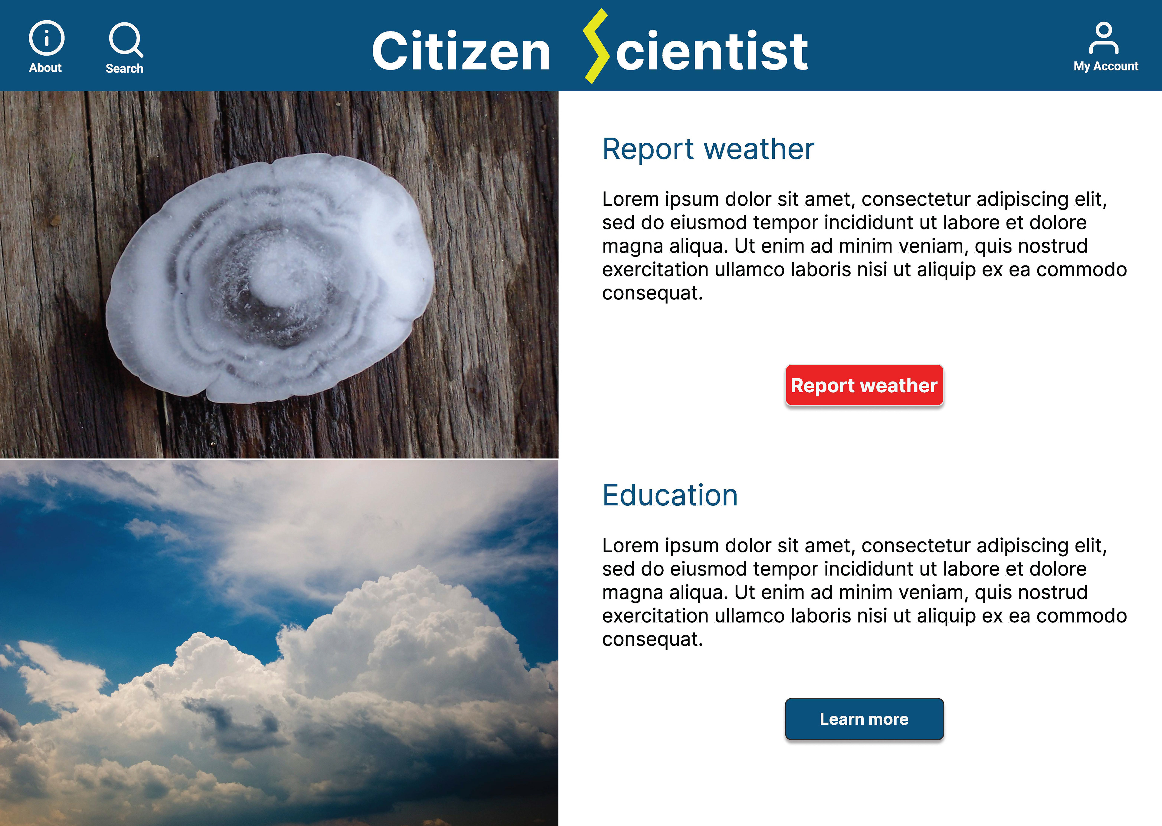
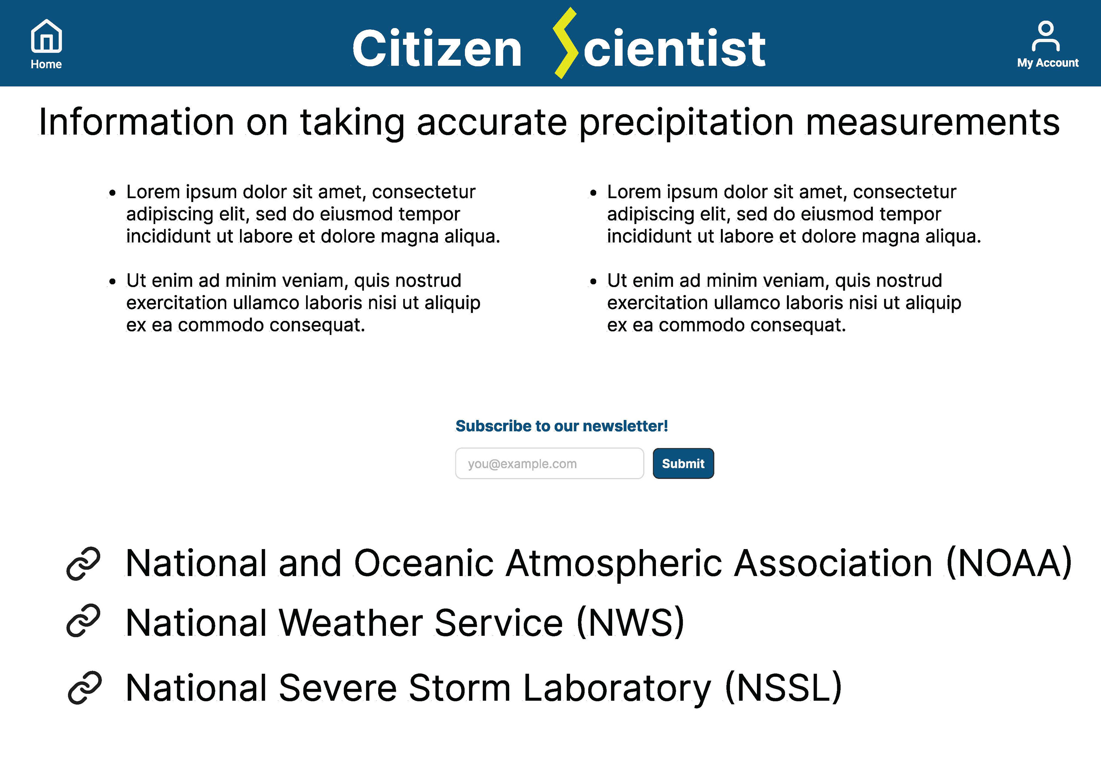
Demo Landing Page: Using Claude and Goose, I built a landing page for an app that I designed during a UX course. This page is meant to advertise the app to potential investors, and is for demo purposes only.
I also created a desktop version in case a user did not have access to a mobile device, again using low and high fidelity wireframes in Figma.
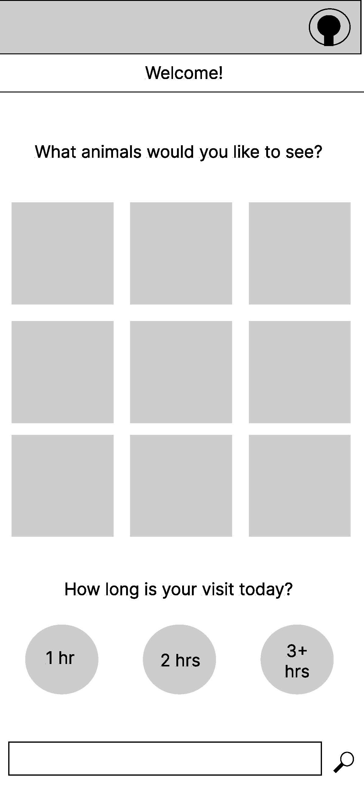
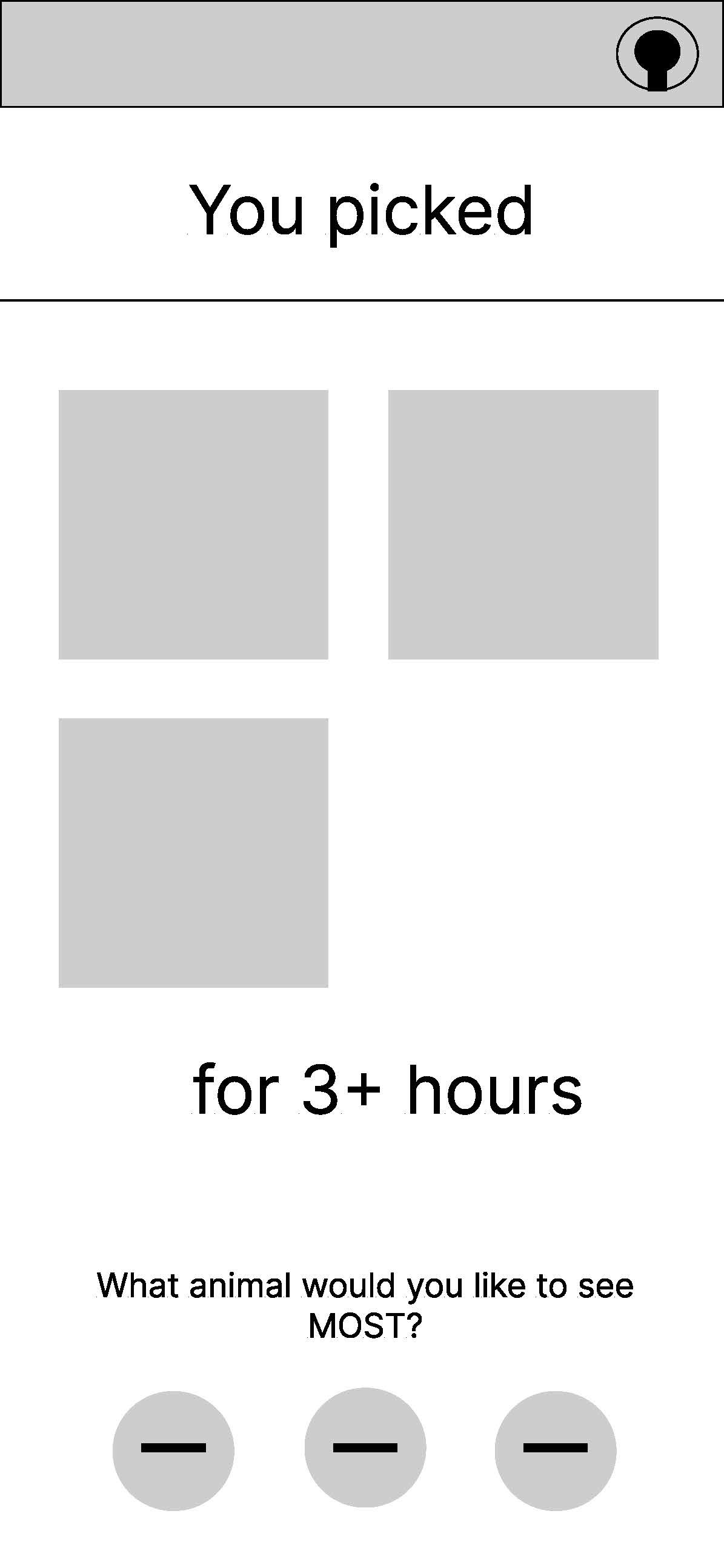
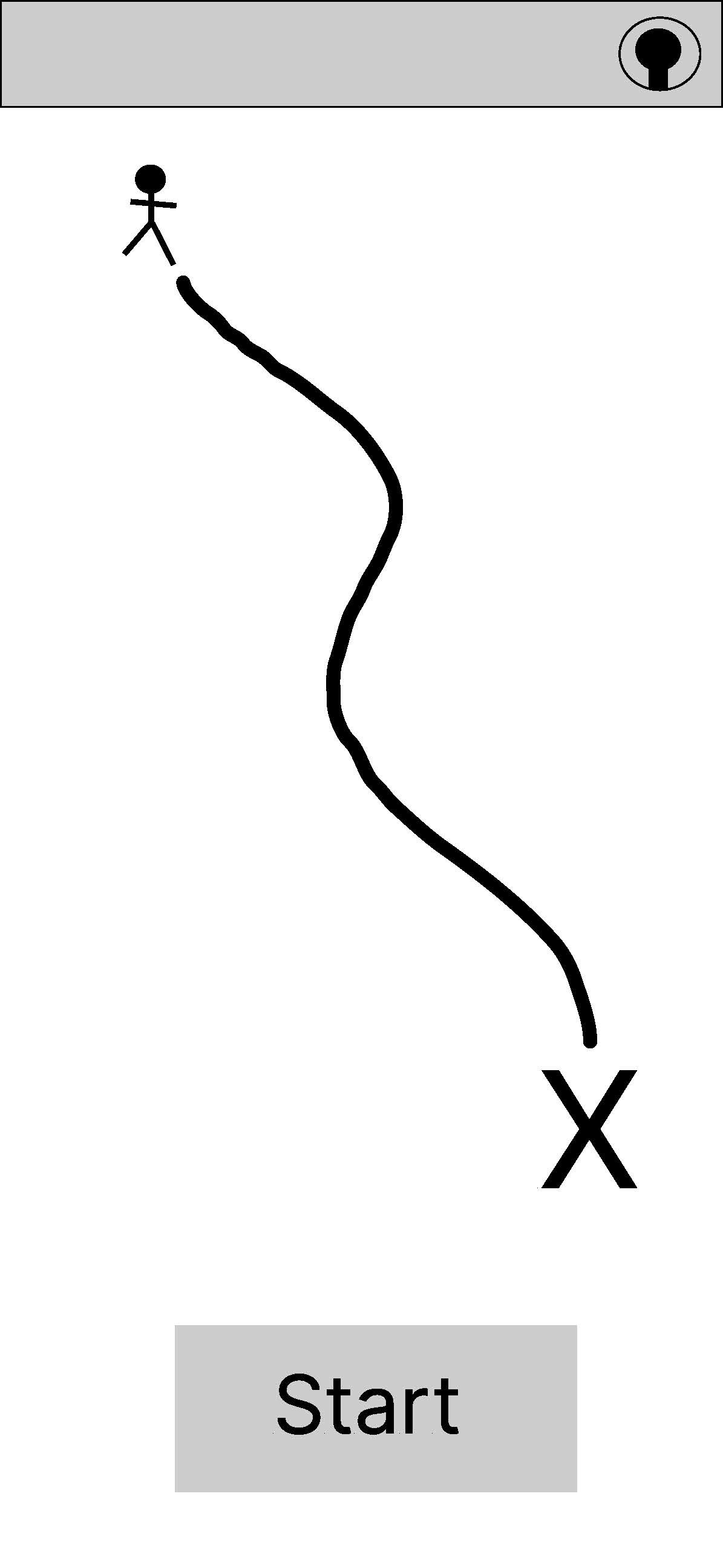
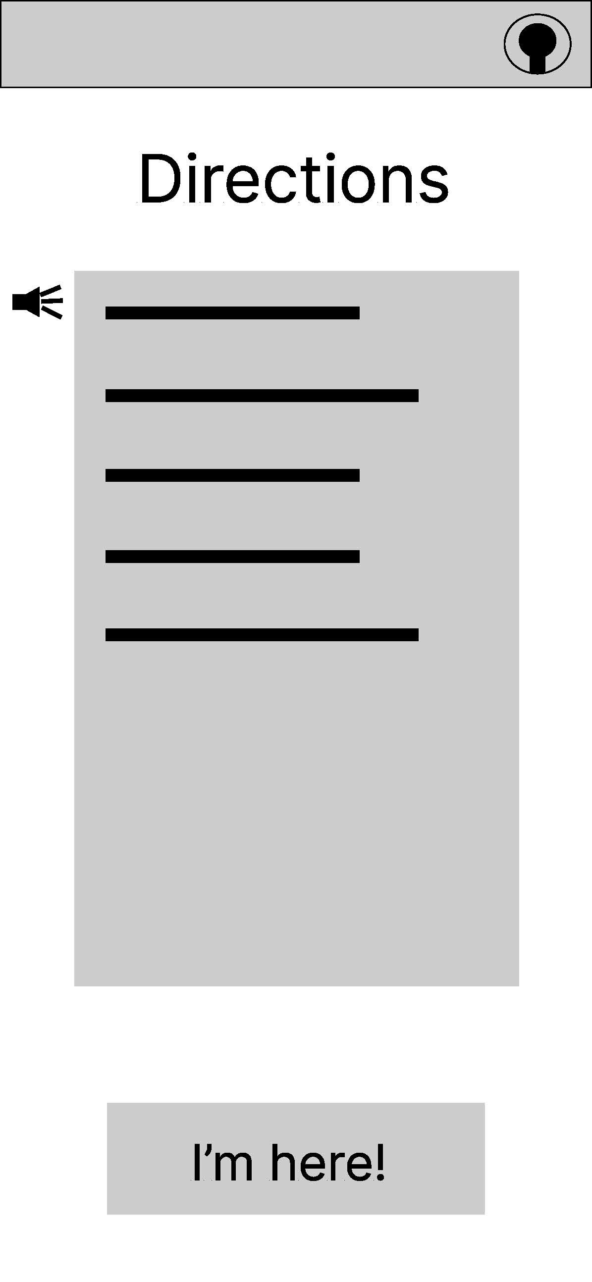
Case Study 2: Zoo Navigation App
The Background: Zoos are often large and sprawling, involving a lot of walking and searching to find certain exhibits of interest to visitors. Often, it might be hot or crowded, and visiting families may be wrangling small children. It's likely that these visitors would want to see as many exhibits as they can before their children tire, and also want to teach them about the animals that they are seeing.
The Problem: It can be hard to find an exhibit of interest. Sometimes signage is scant or confusing, and visitors may not want to wander aimlessly. On crowded days, it may be difficult to get to the exhibit information display.
The Solution: Design an app that leads people to the exhibit of their choice in zoo. Provide navigational information, and list the exhibits that may be seen along the routes. Once at an exhibit, provide the information listed on the display directly to the user via the mobile app.
User Experience Research: Again, I began by researching what was already in existence for this type of data reporting. Navigational apps are abundant, so I kept their basic design in mind. Wikipedia and other encyclopedia-type apps also already exist as well, but to my knowledge, there is not a zoo that combines these two ideas into a specialized app.
I also conducted interviews with family members and friends, both with kids and without kids. I wanted a sample size that would represent a variation of users who would likely have different experience goals in mind for their zoo visits.
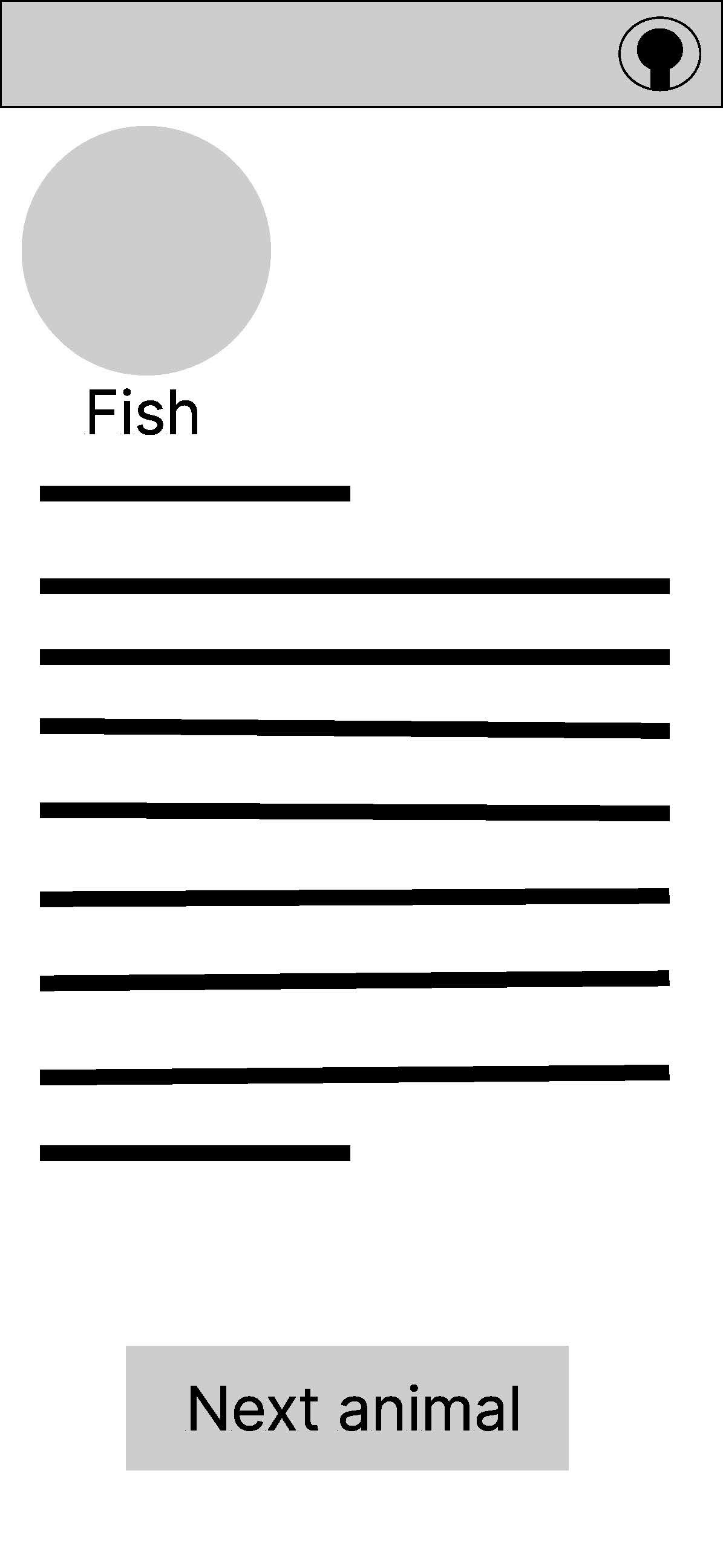
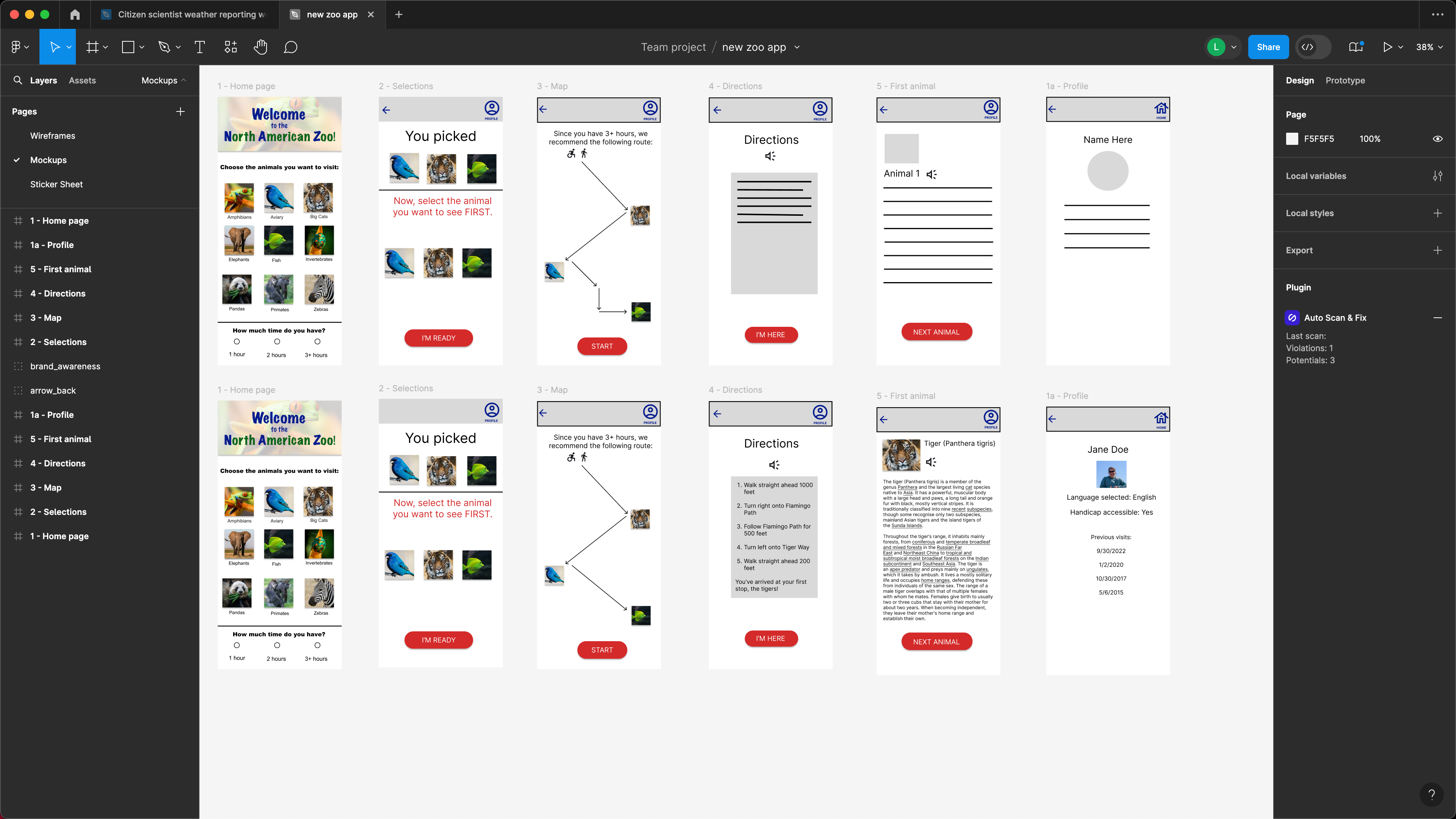
Wireframing and Design: As in the first project, I began with an outline of how I wanted the app to look, and then did some basic wireframing on paper. Once I was satisfied with the layout and the order of the screens, I made high and low fidelity wireframes in Figma. As it seemed unlikely that this would be useful on a desktop computer, I did not design this for anything other than a mobile device.